#KHStudy for SPAN CV
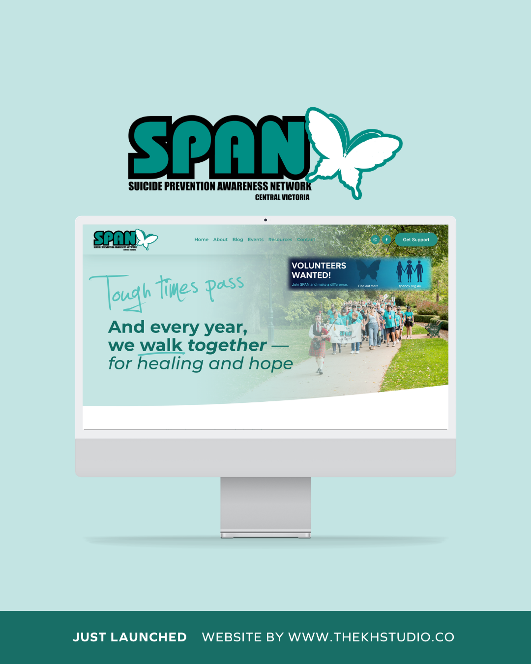
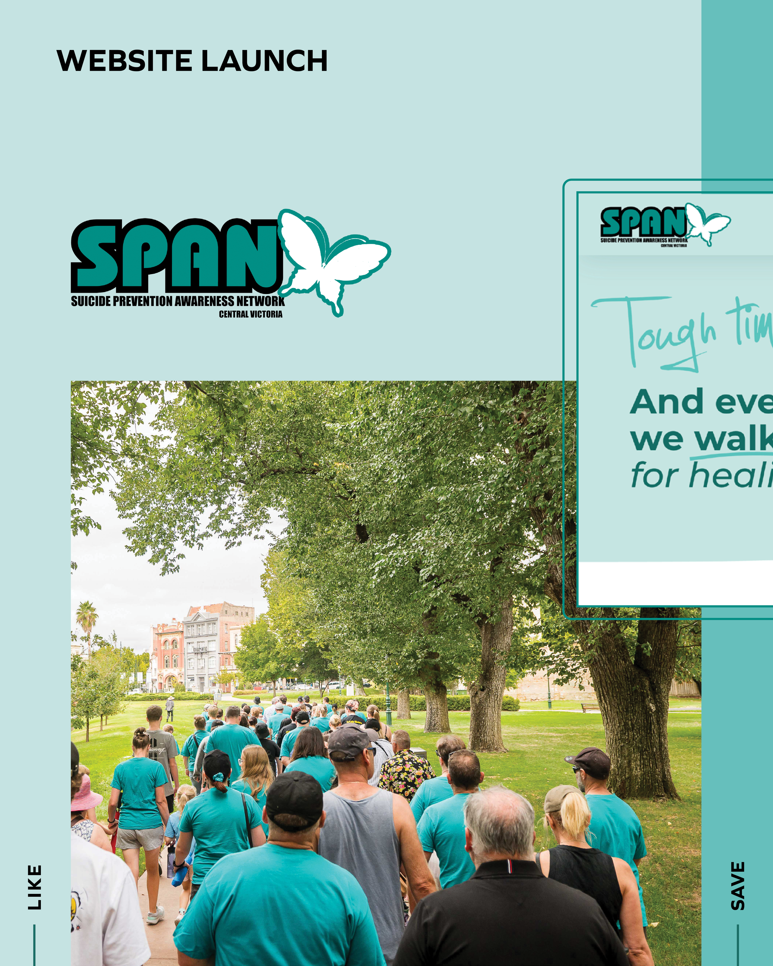
Recent Website launch for SPAN CV
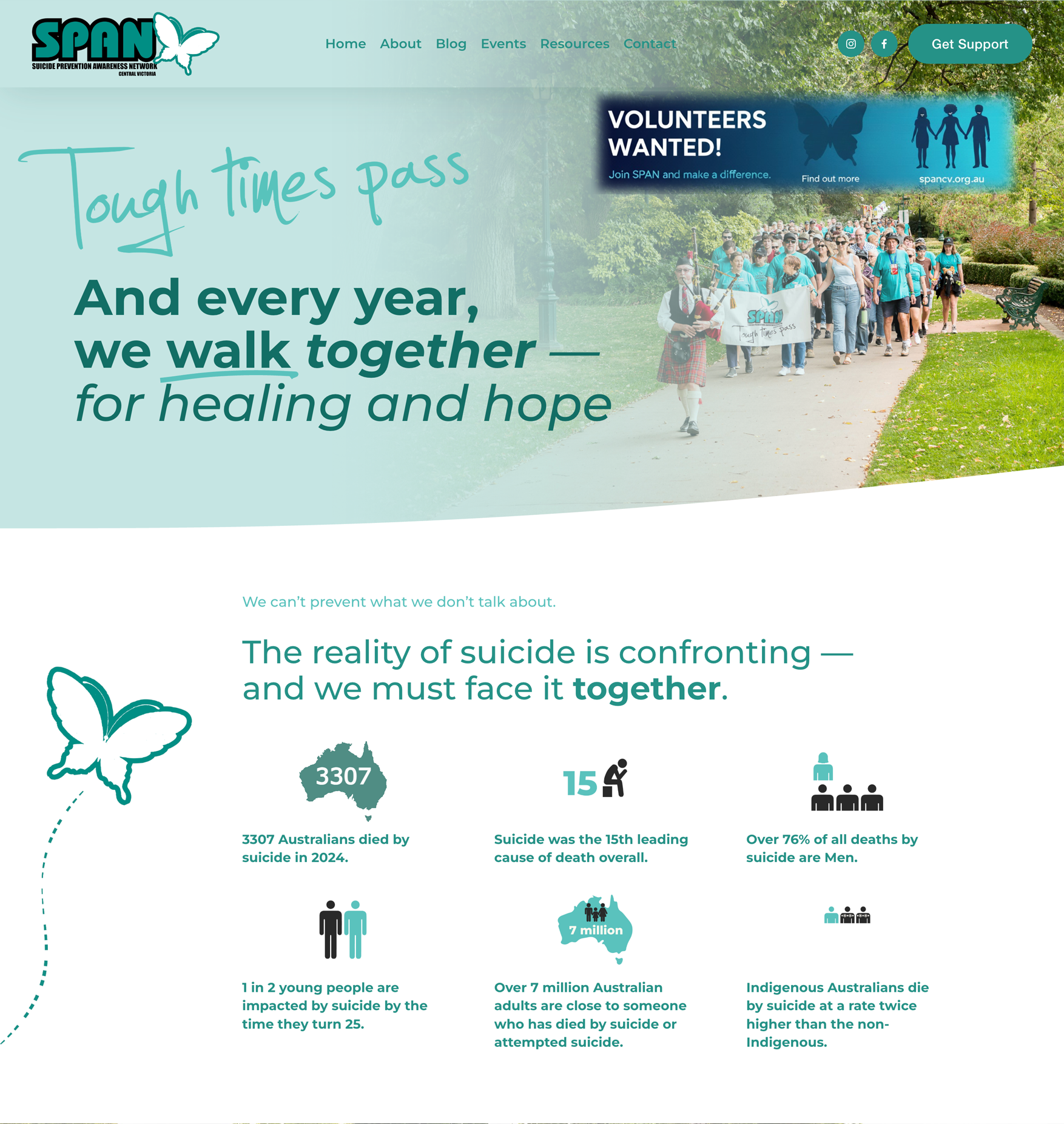
A Website Designed to Support Conversation, Community and Hope
Some projects are commercial.
Some are strategic.
And some carry a responsibility that goes far beyond design.
SPAN Central Victoria (Suicide Prevention Awareness Network) is a community-based movement built on one simple, powerful belief:
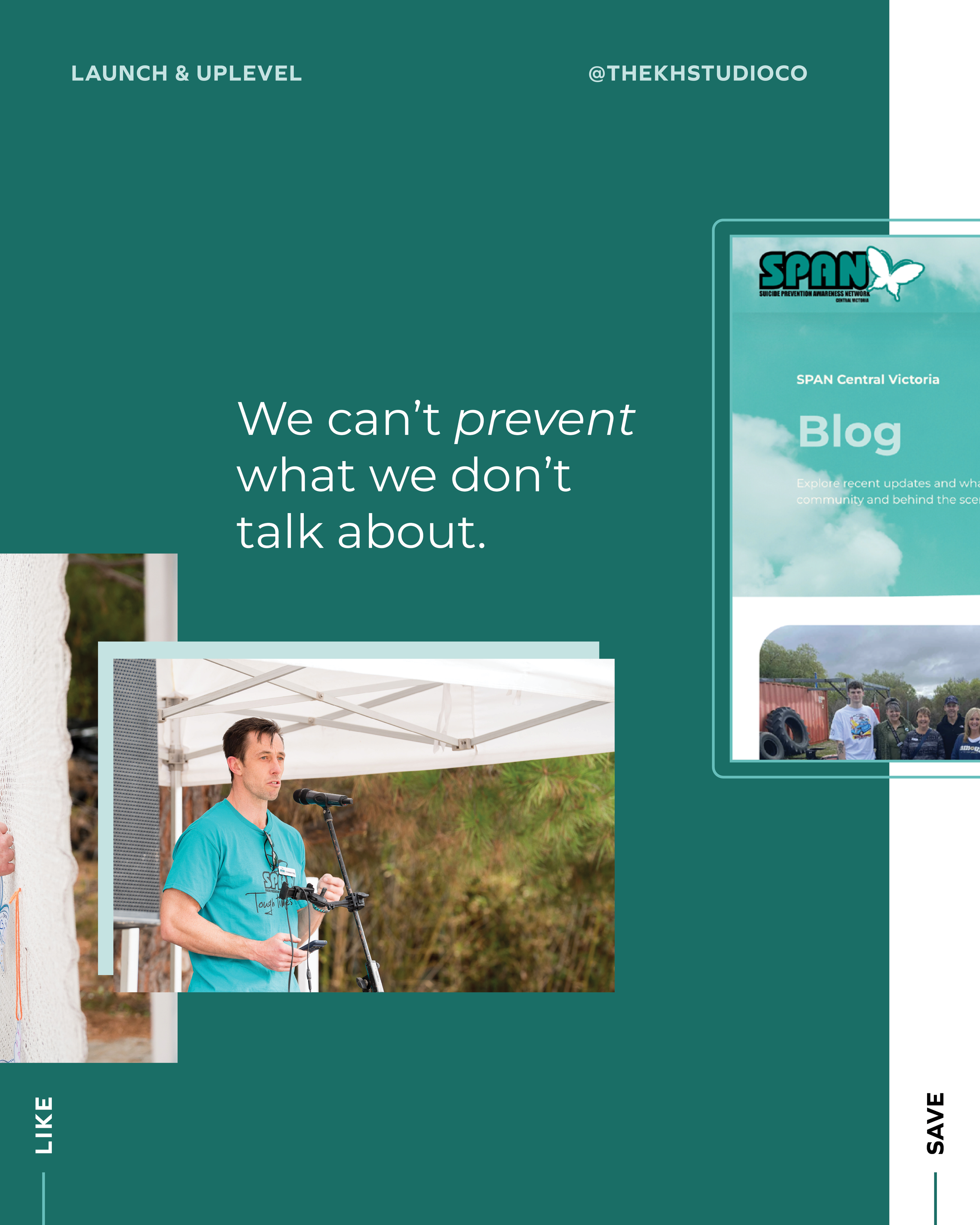
Conversations can change — and save — lives.
When SPAN approached The KH Studio, this wasn’t just about refreshing a website. It was about creating a digital space that reflects compassion, strength and unity — while clearly guiding people to support when they need it most.
This project holds deep meaning for our team, and we’re incredibly proud to stand alongside SPAN in their mission.
Designing with Sensitivity First
Mental health and suicide prevention require careful handling.
The website needed to:
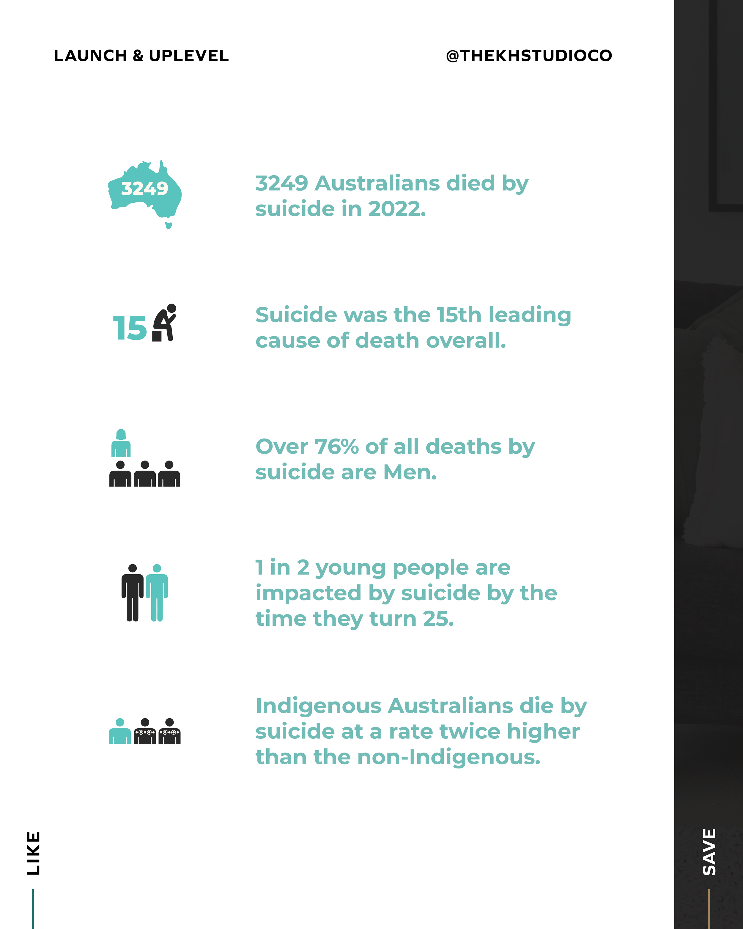
Speak truthfully without being confronting
Provide statistics responsibly and accurately
Offer reassurance without minimising the issue
Direct visitors to support clearly and immediately
Remain compliant and ethically structured
The tone had to feel gentle, human and hopeful — while still grounded in reality.
Every design and copy decision was made with care.
Strategy: Clear Pathways in Moments of Vulnerability
Visitors to SPAN’s website arrive for different reasons:
Seeking support
Looking for crisis information
Wanting to volunteer
Learning about the Annual Walk
Searching for community involvement
The strategy centred on clarity.
Support buttons are visible and accessible.
Helpline information is prioritised and repeated.
Navigation is simple and distraction-free.
If someone arrives in a vulnerable state, they should never have to search for help.
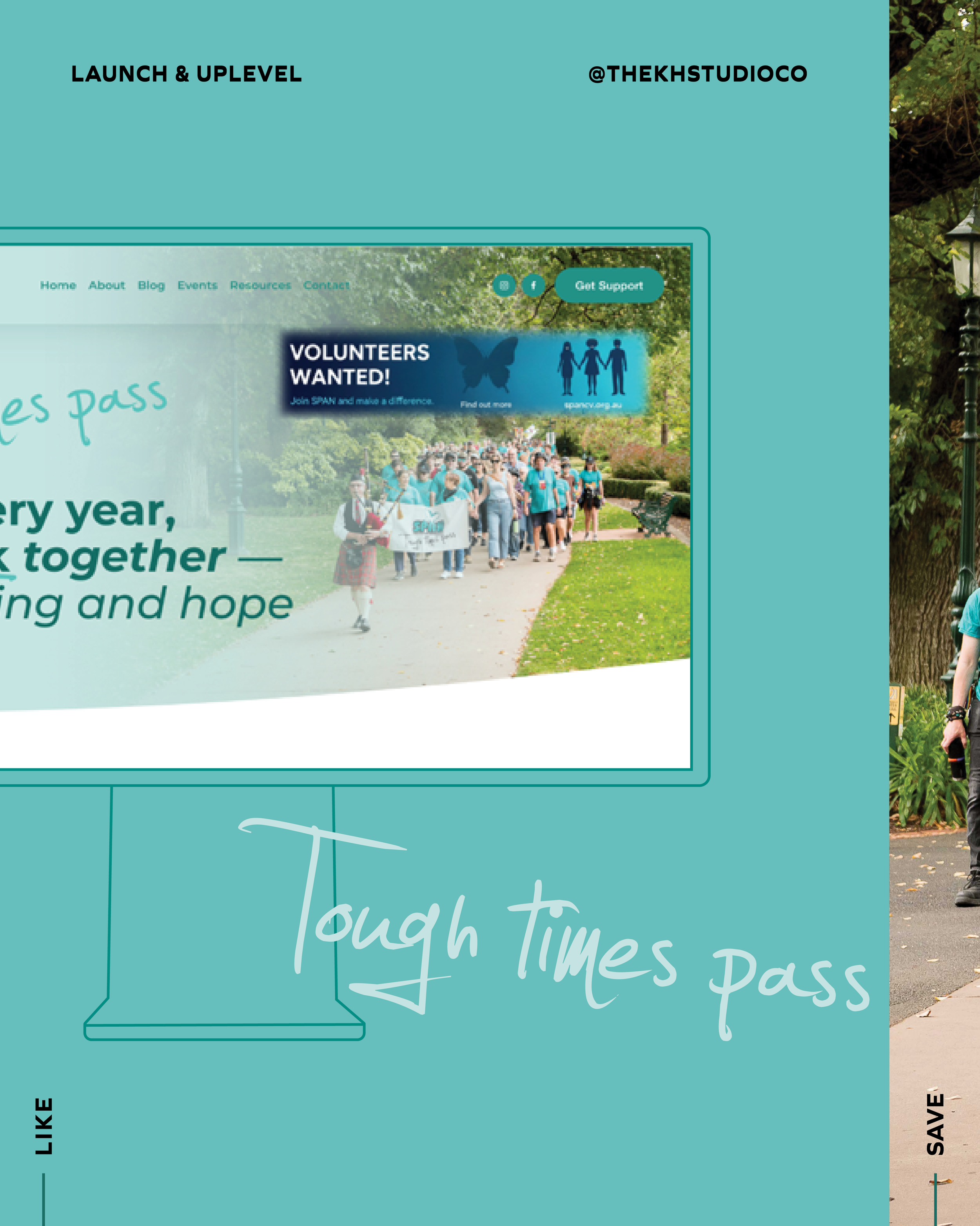
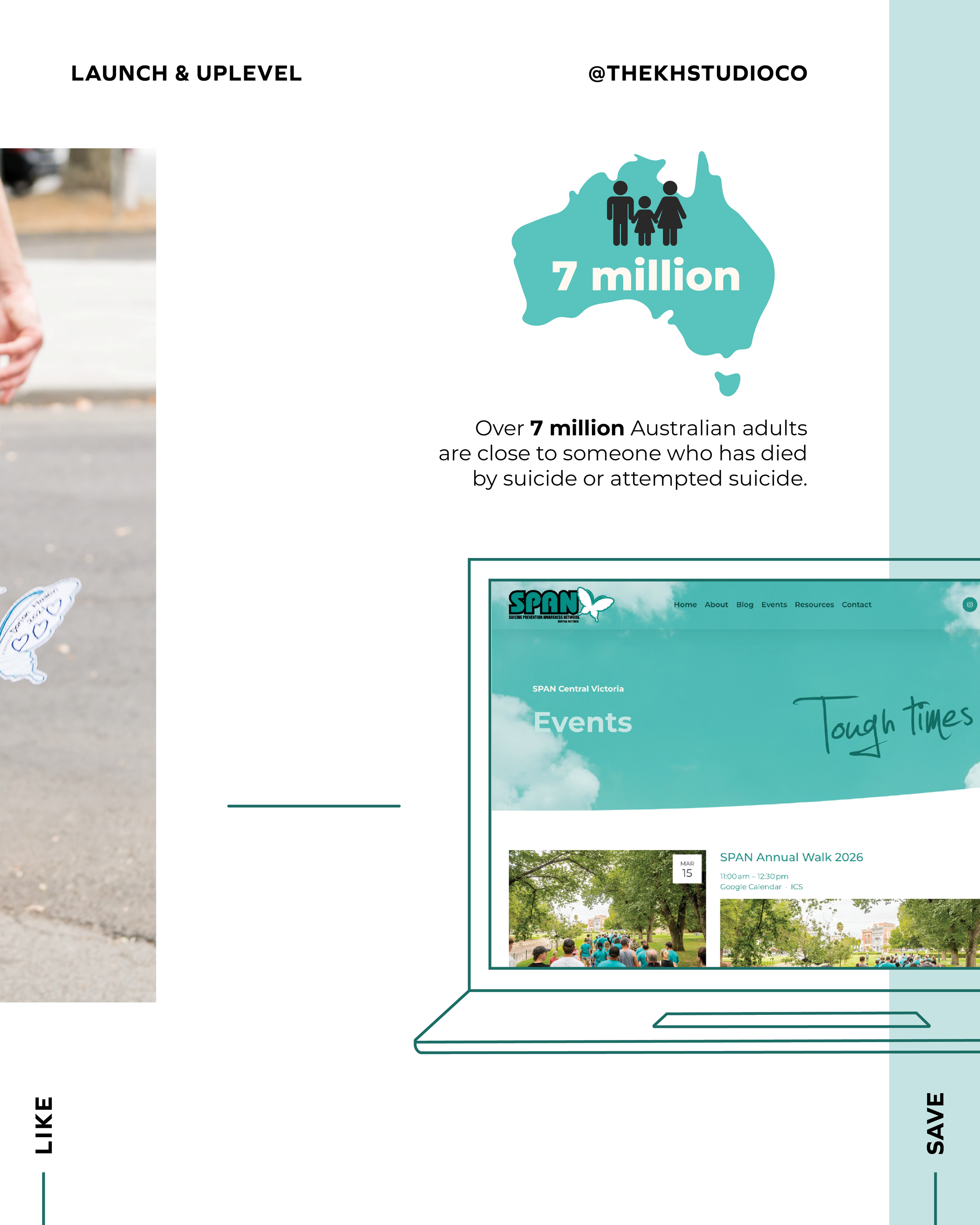
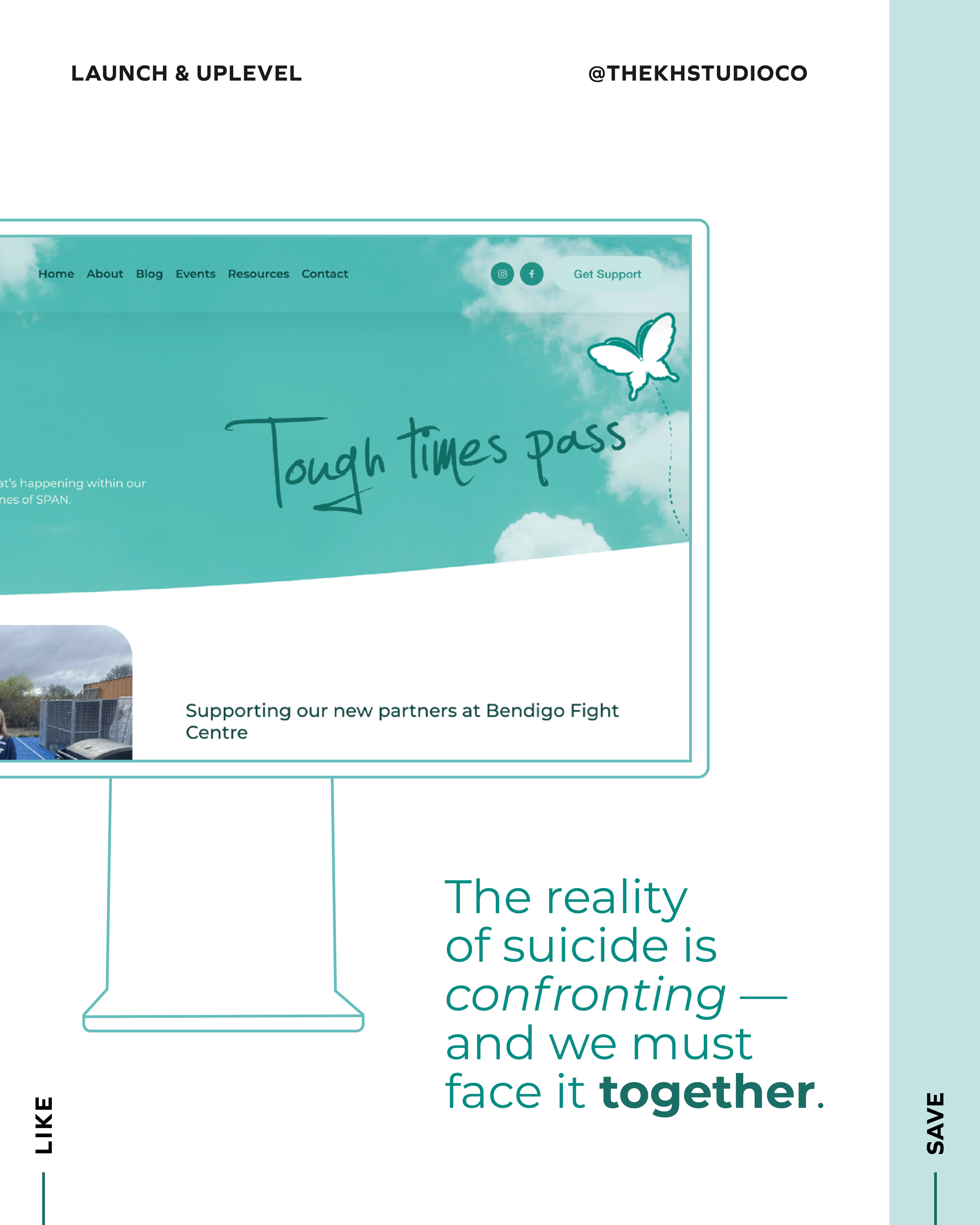
Long-Scrolling Experience Pages That Guide Gently
We built long-scrolling experience pages that feel calm, structured and intentional.
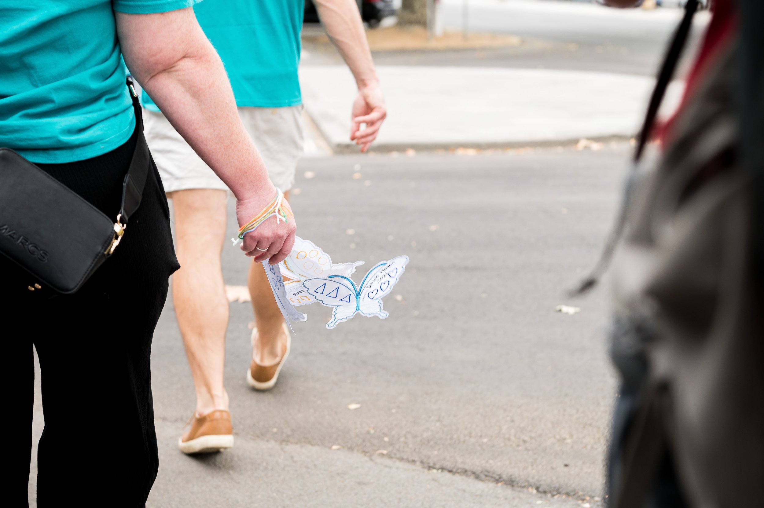
Soft gradients, organic shapes and the butterfly motif create visual continuity and symbolism — representing hope, transformation and remembrance.
The homepage guides users through:
The confronting reality of suicide statistics
SPAN’s mission and purpose
The Annual Walk
Community involvement
Blog updates
Partner organisations
Immediate crisis support
Each section flows naturally into the next, building understanding without overwhelm.
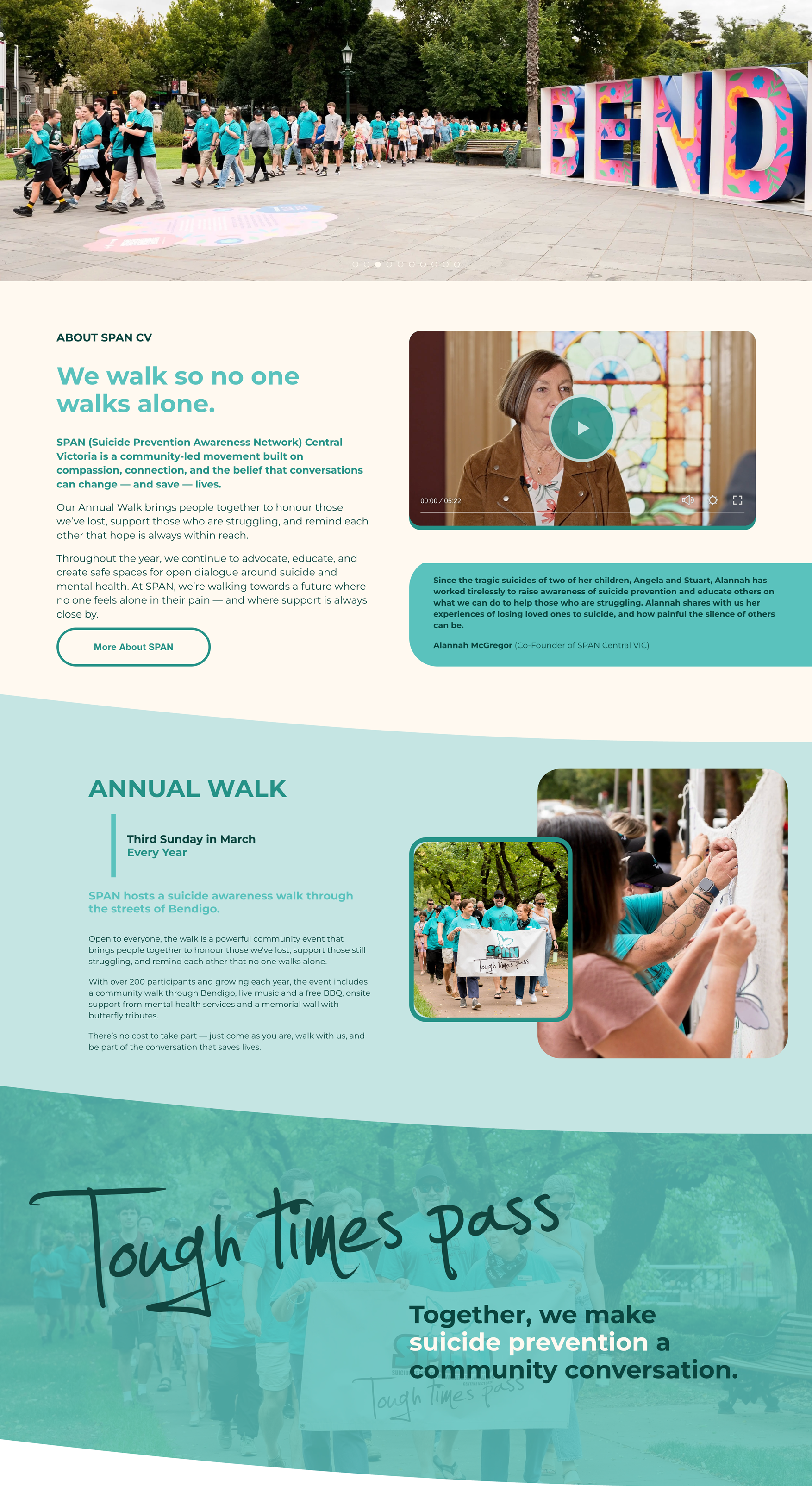
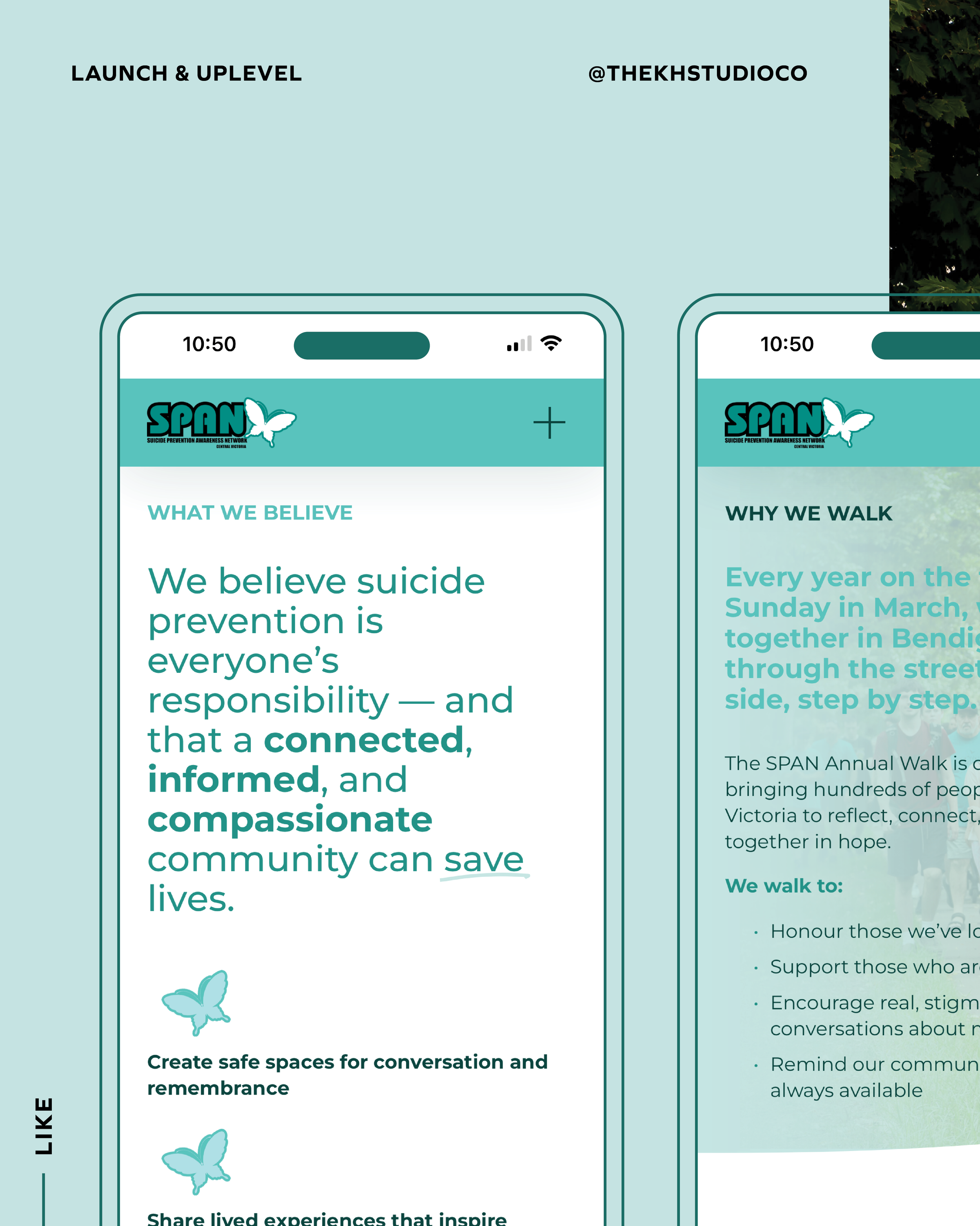
The User Journey Equivalent: Clear Process & Transparency
On the About page, we clearly articulate:
Who SPAN is
Why the walk matters
What the community believes
How the organisation began
How people can get involved
Transparency builds trust — particularly in community-led organisations.
Visitors can see the purpose, the history and the heart behind the movement.
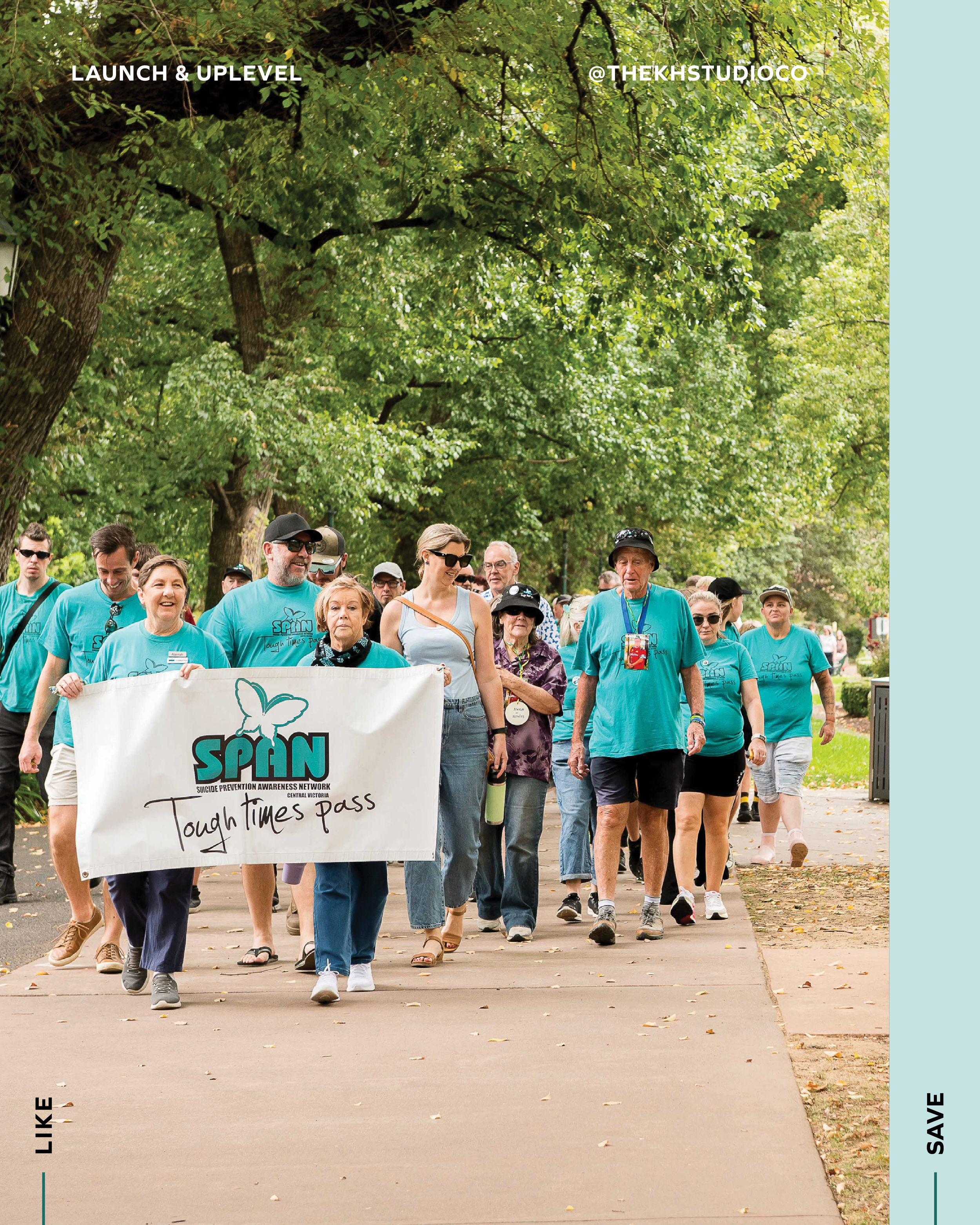
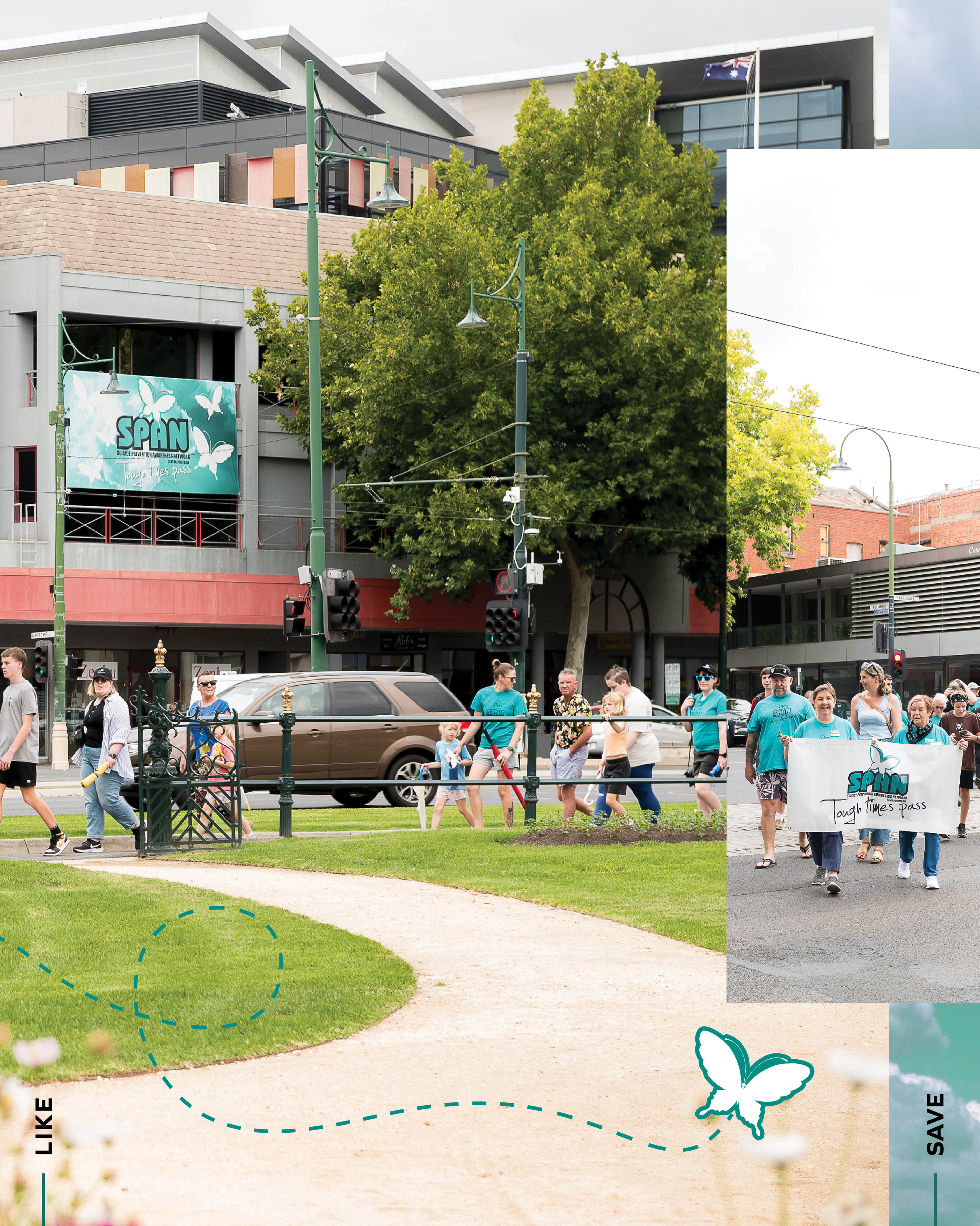
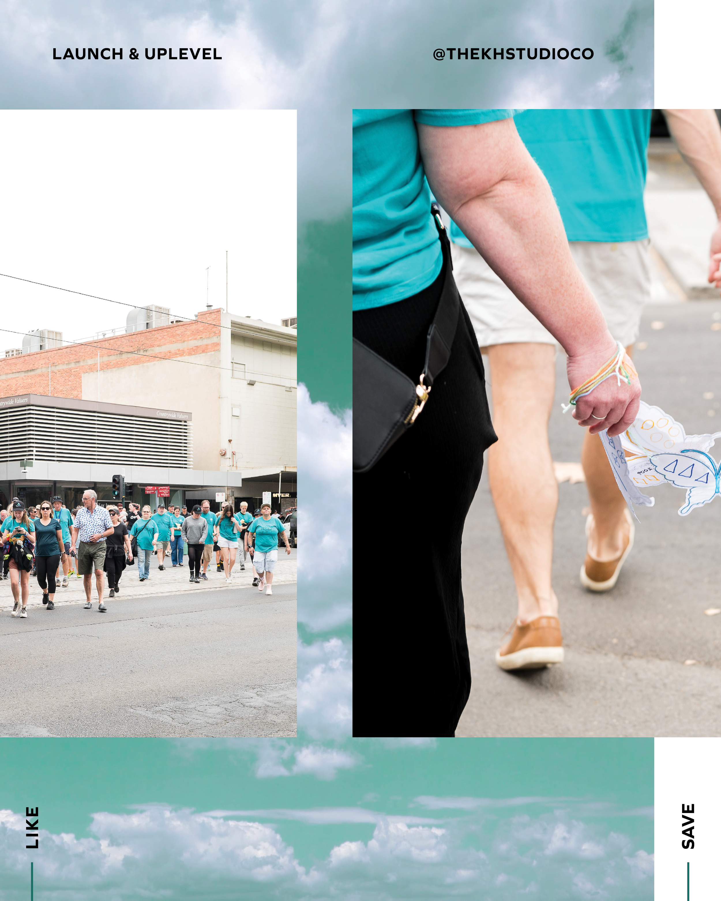
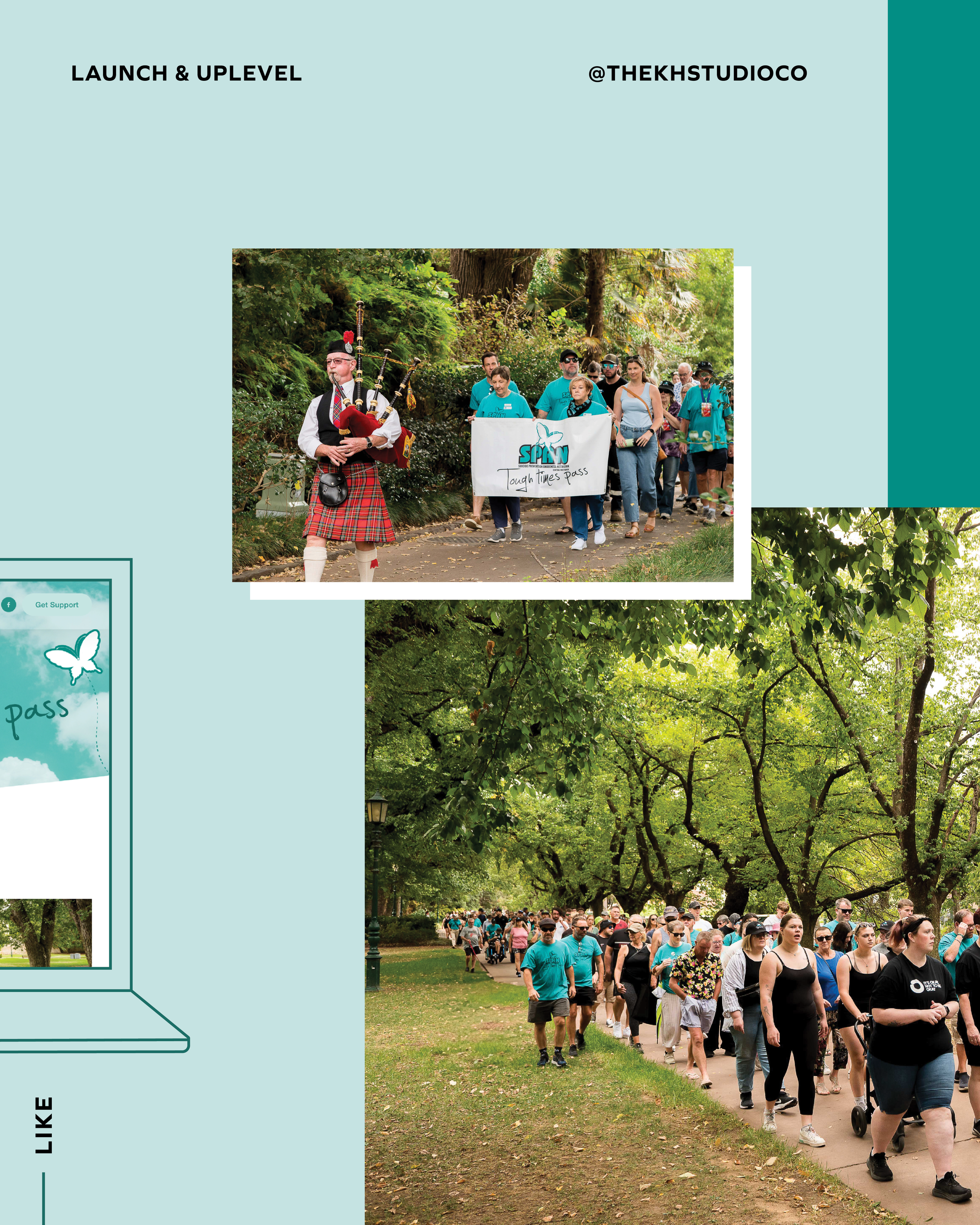
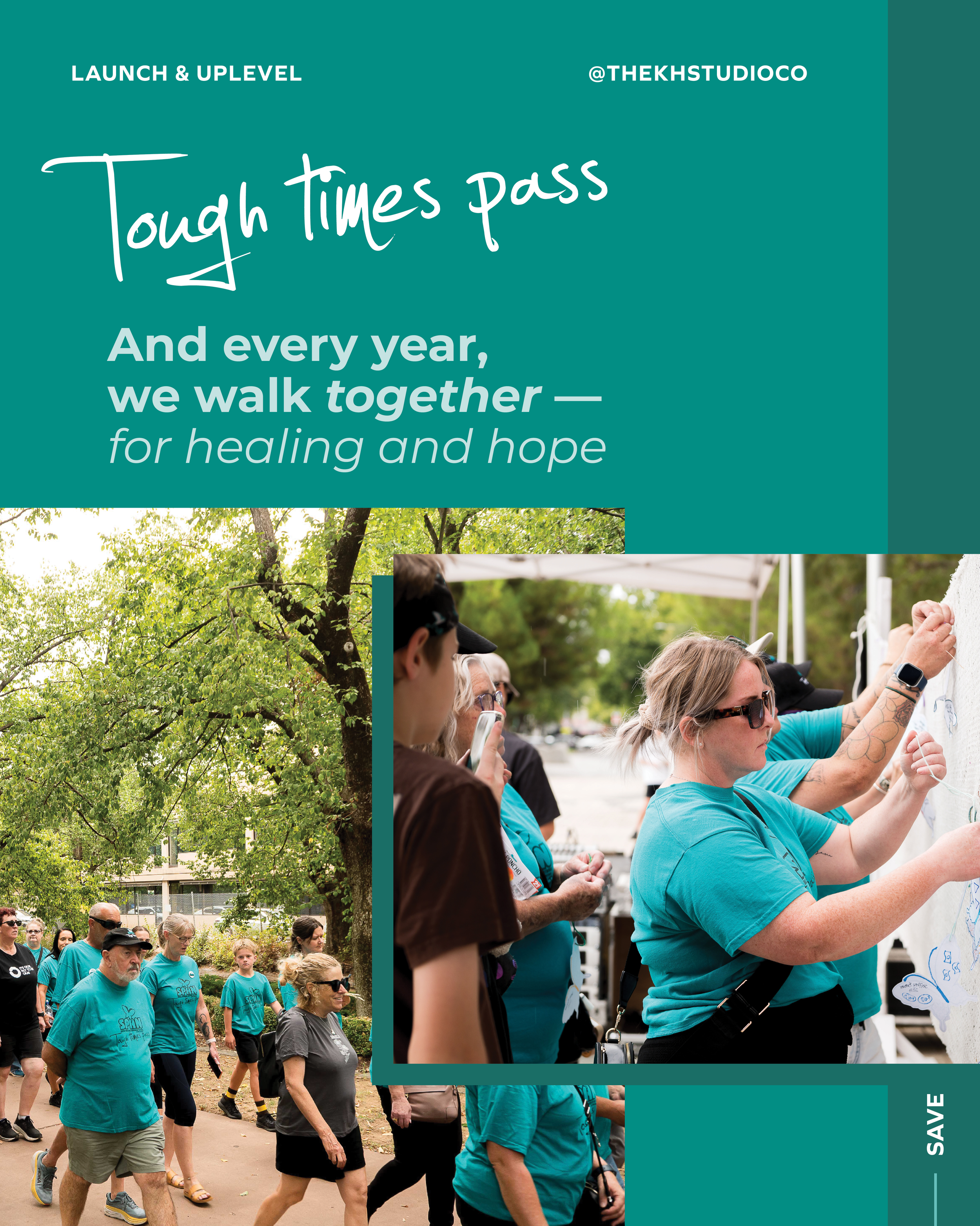
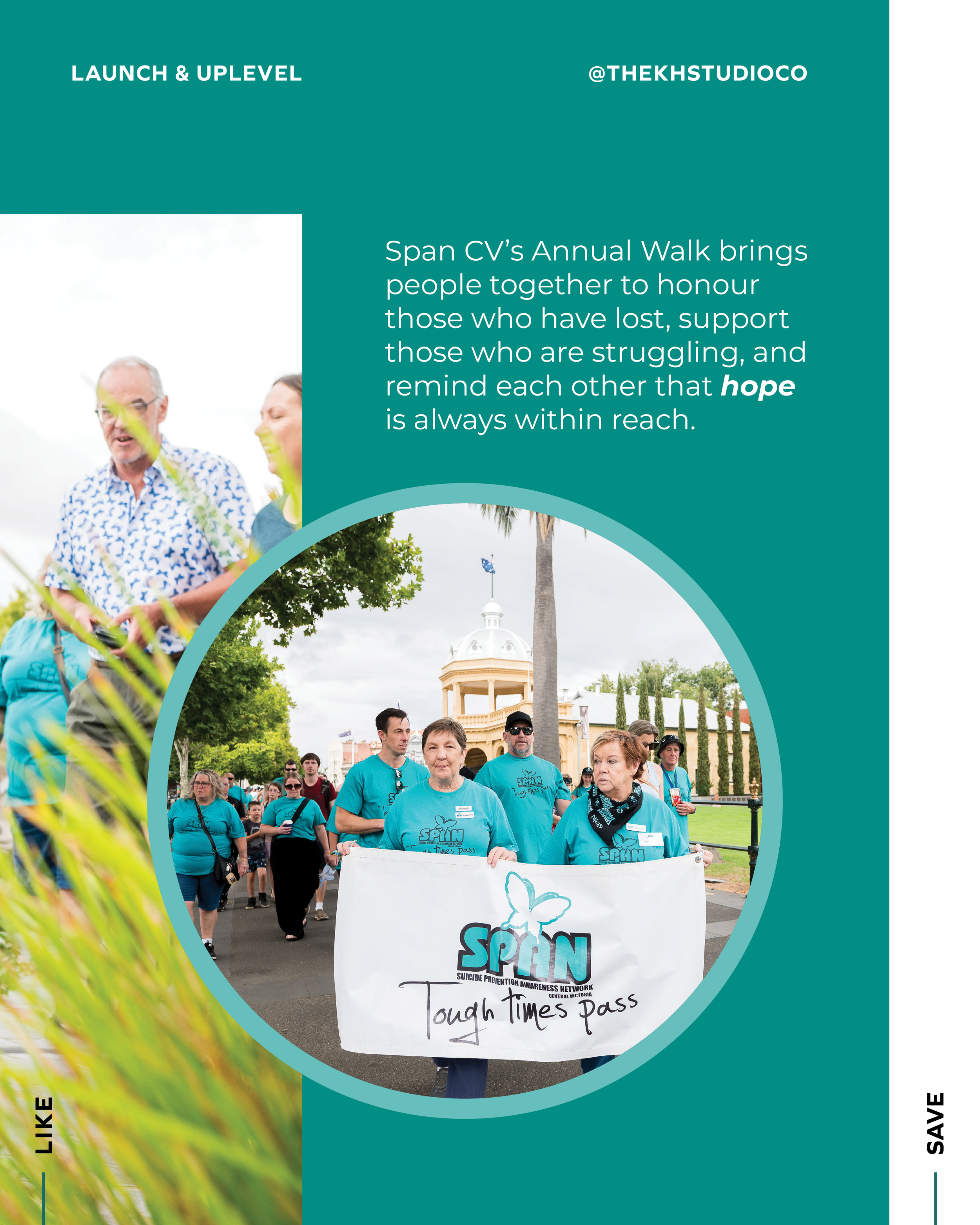
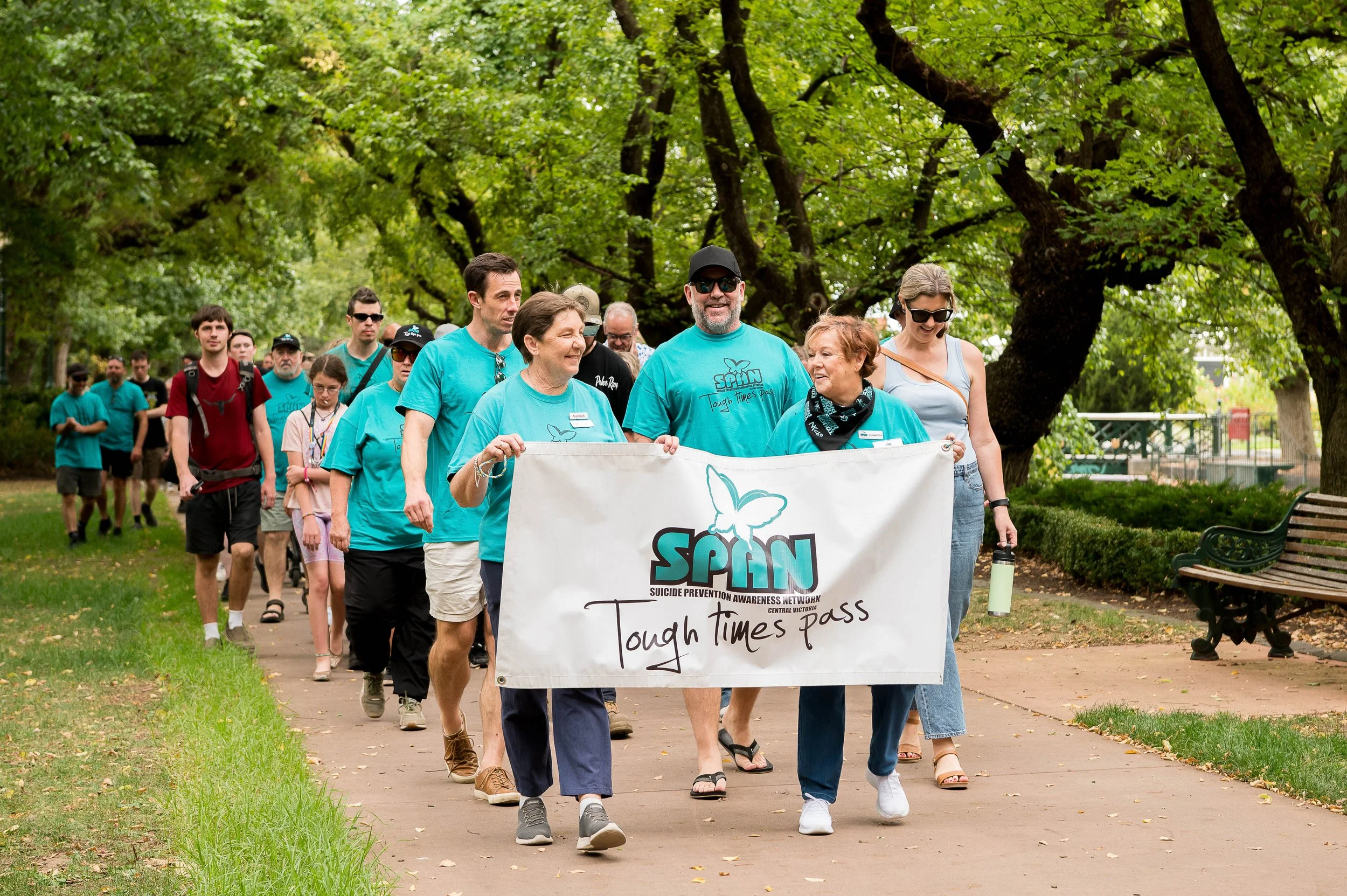
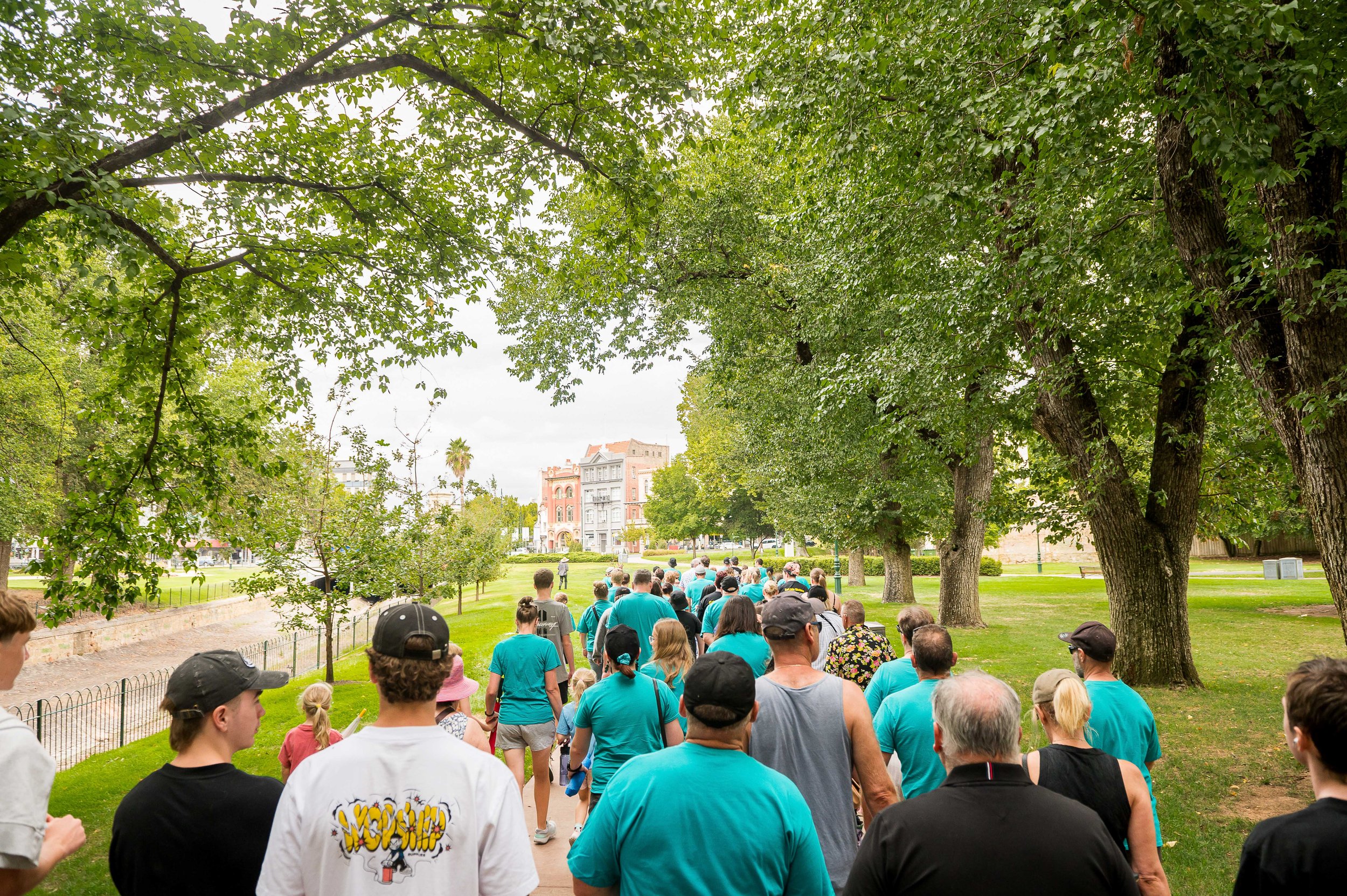
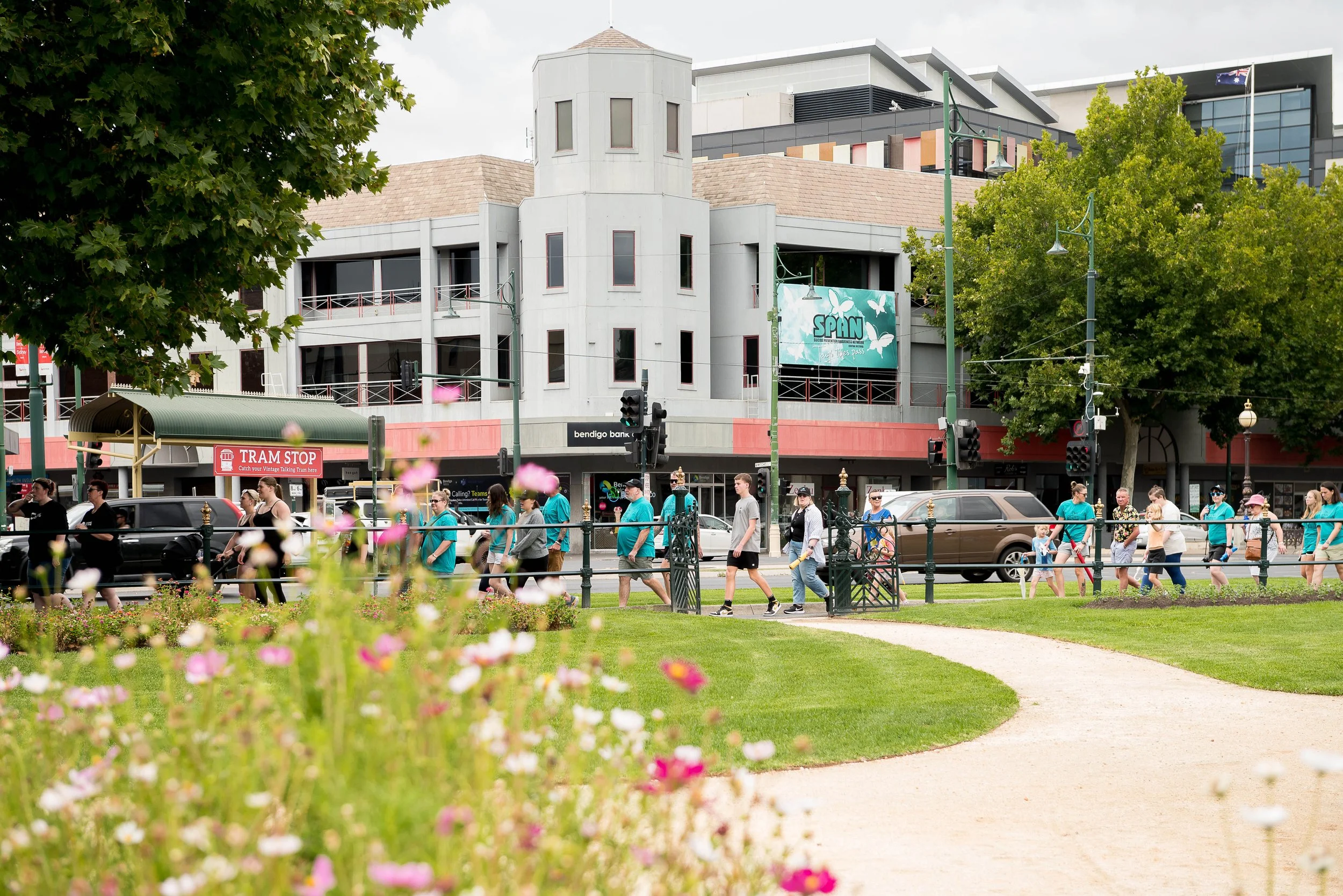
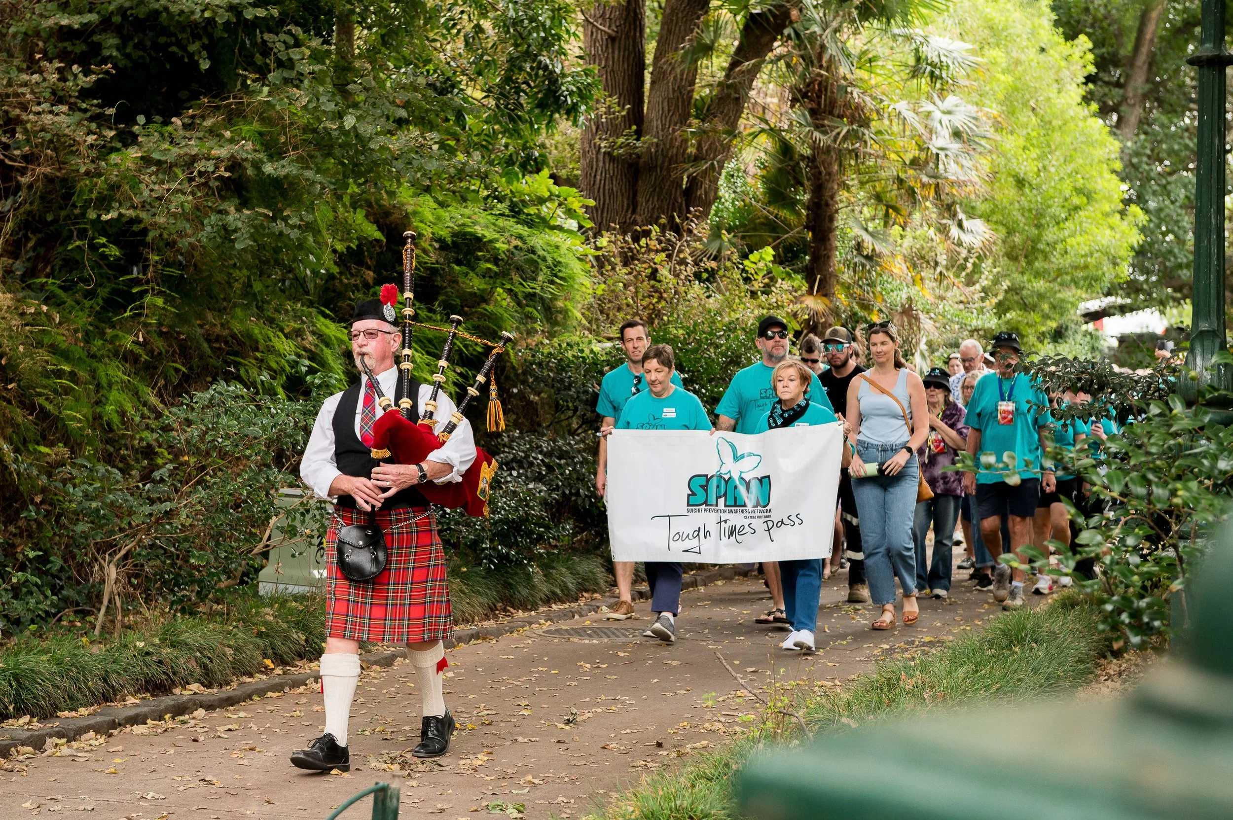
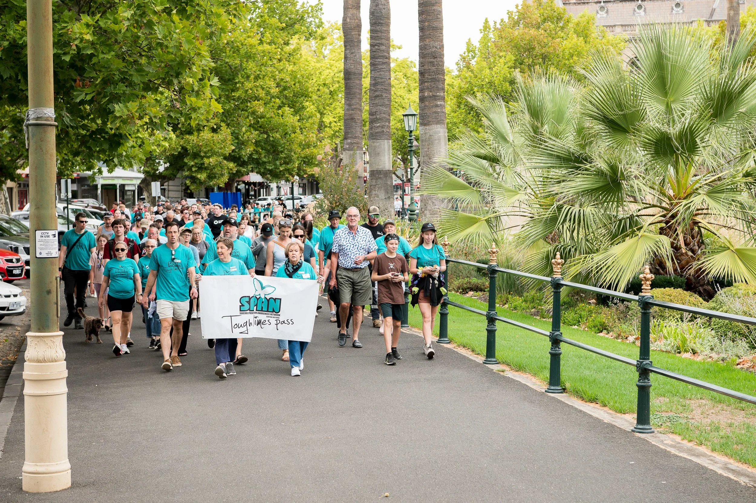
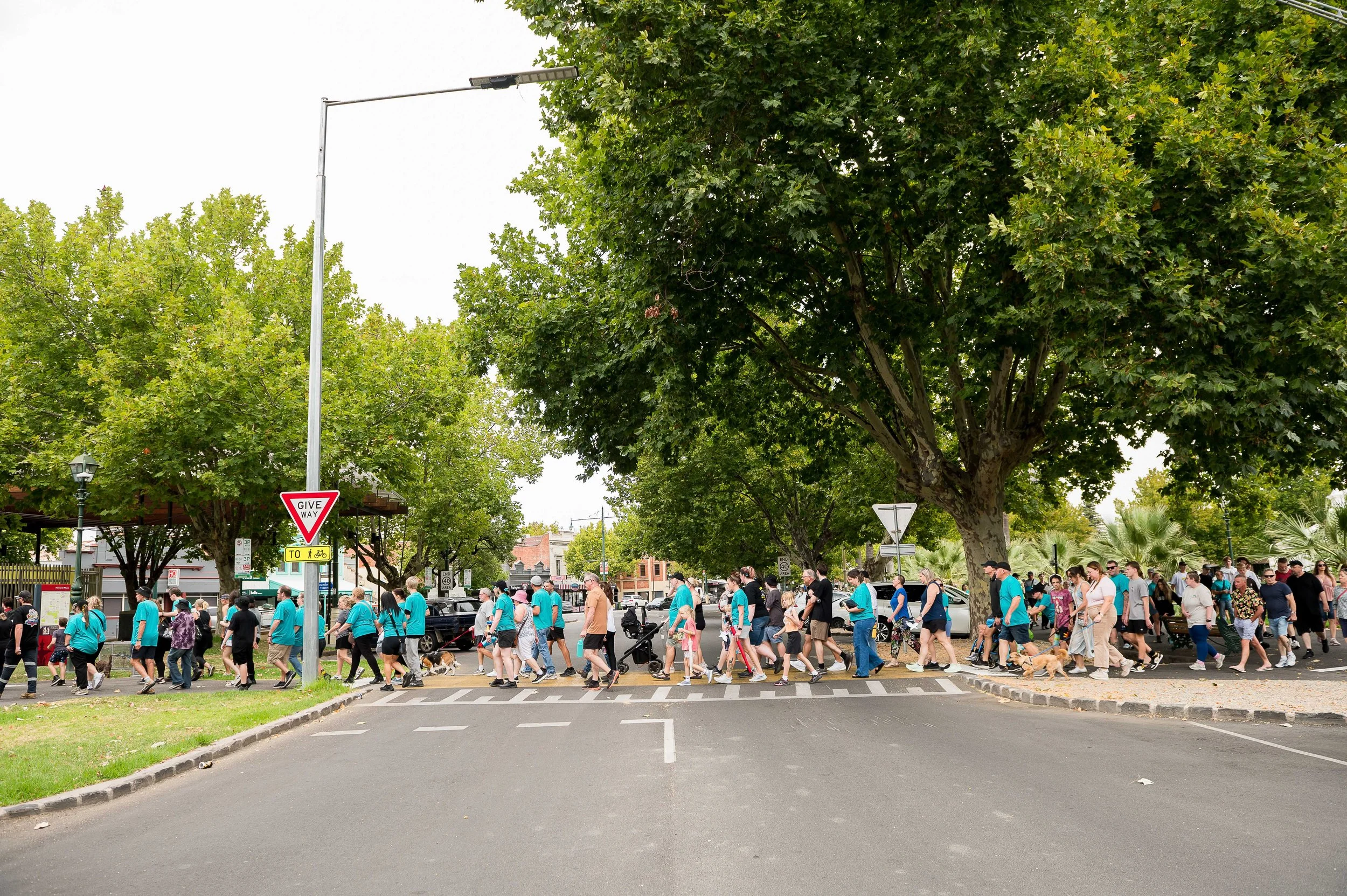
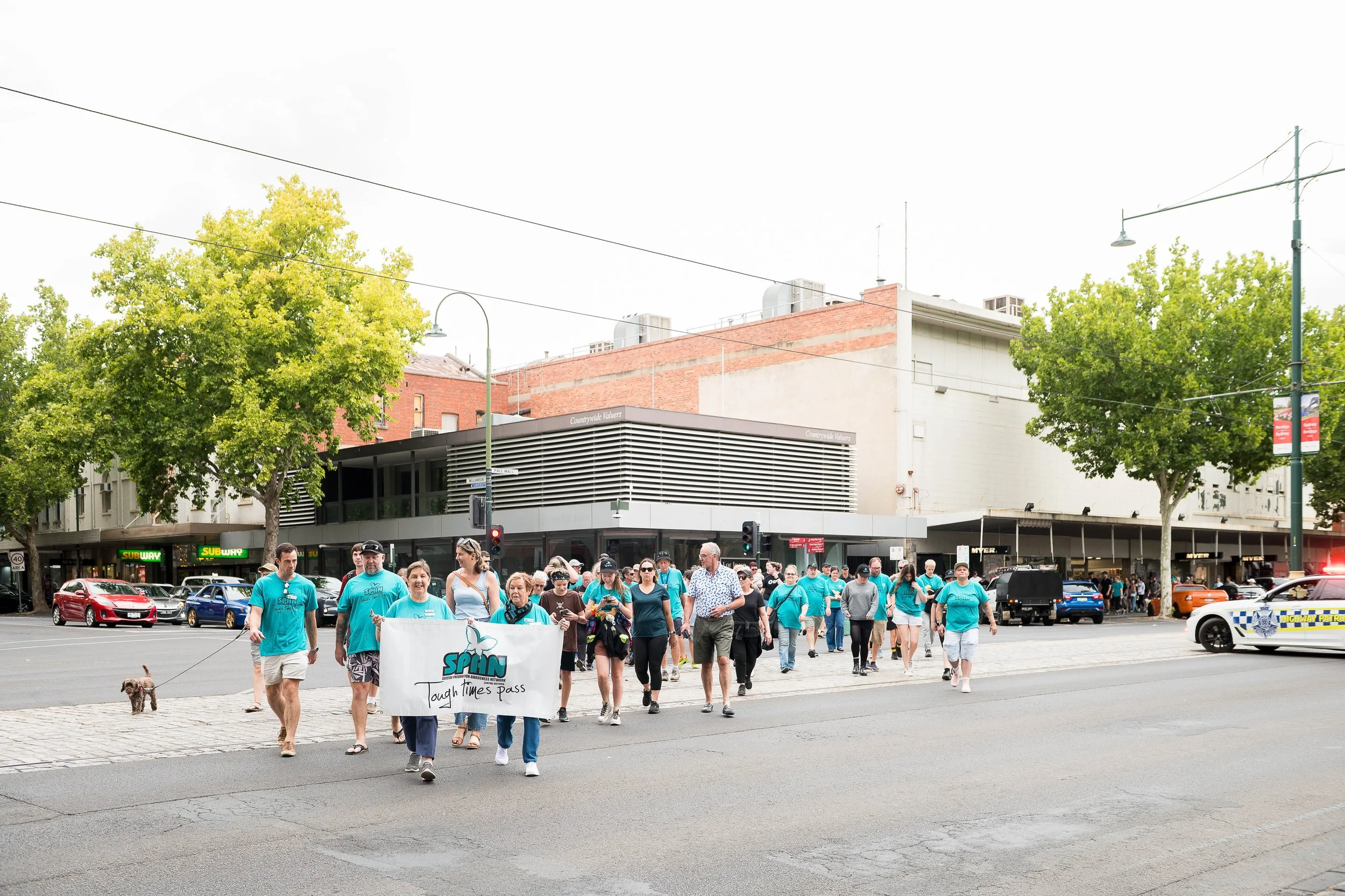
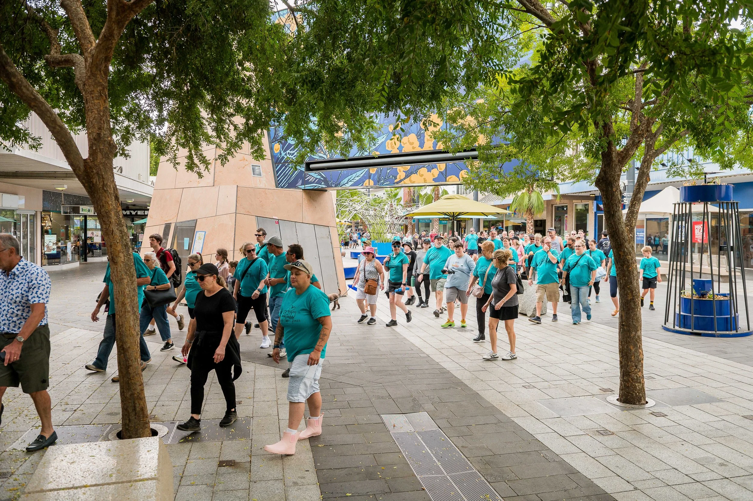
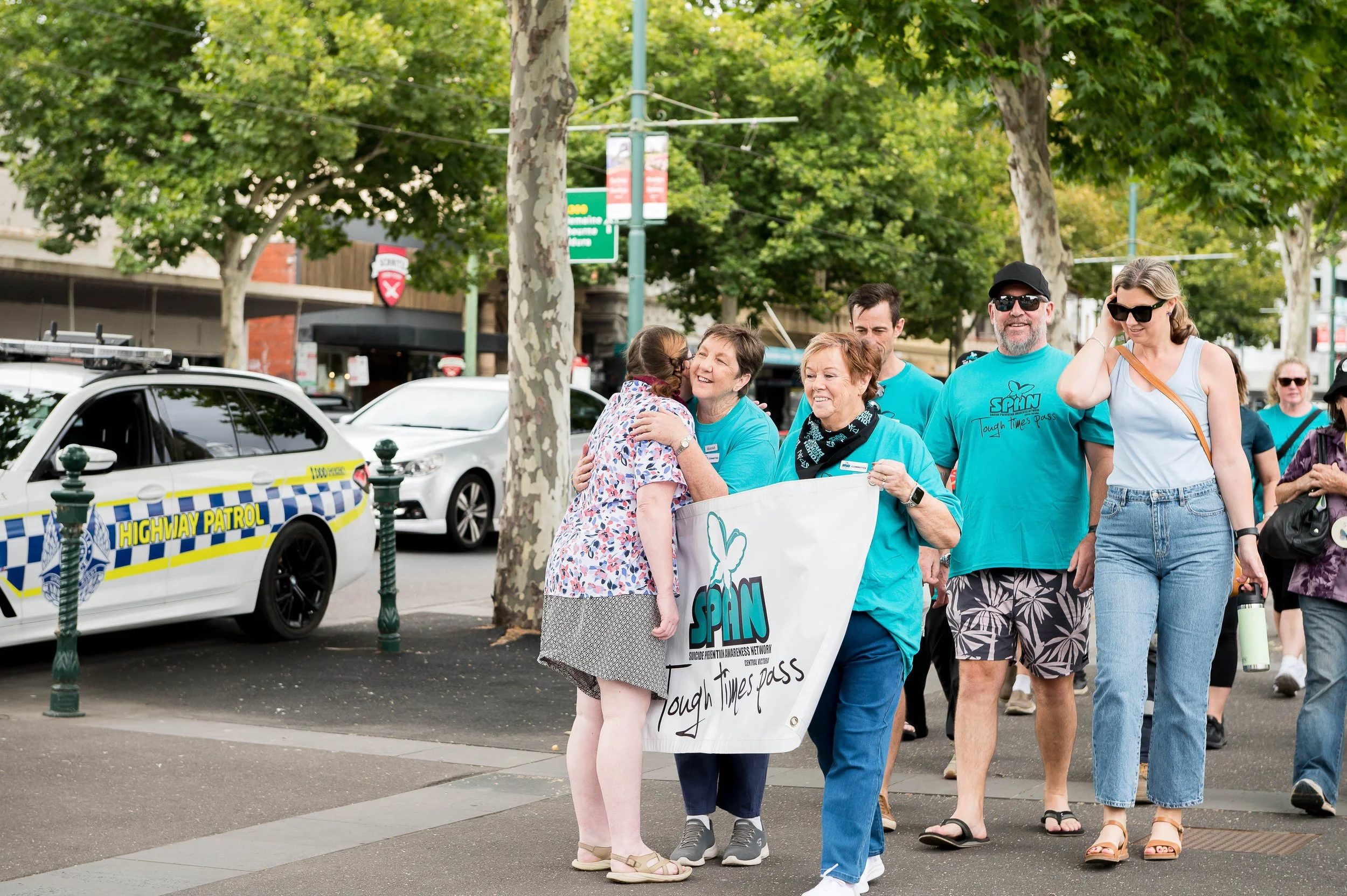
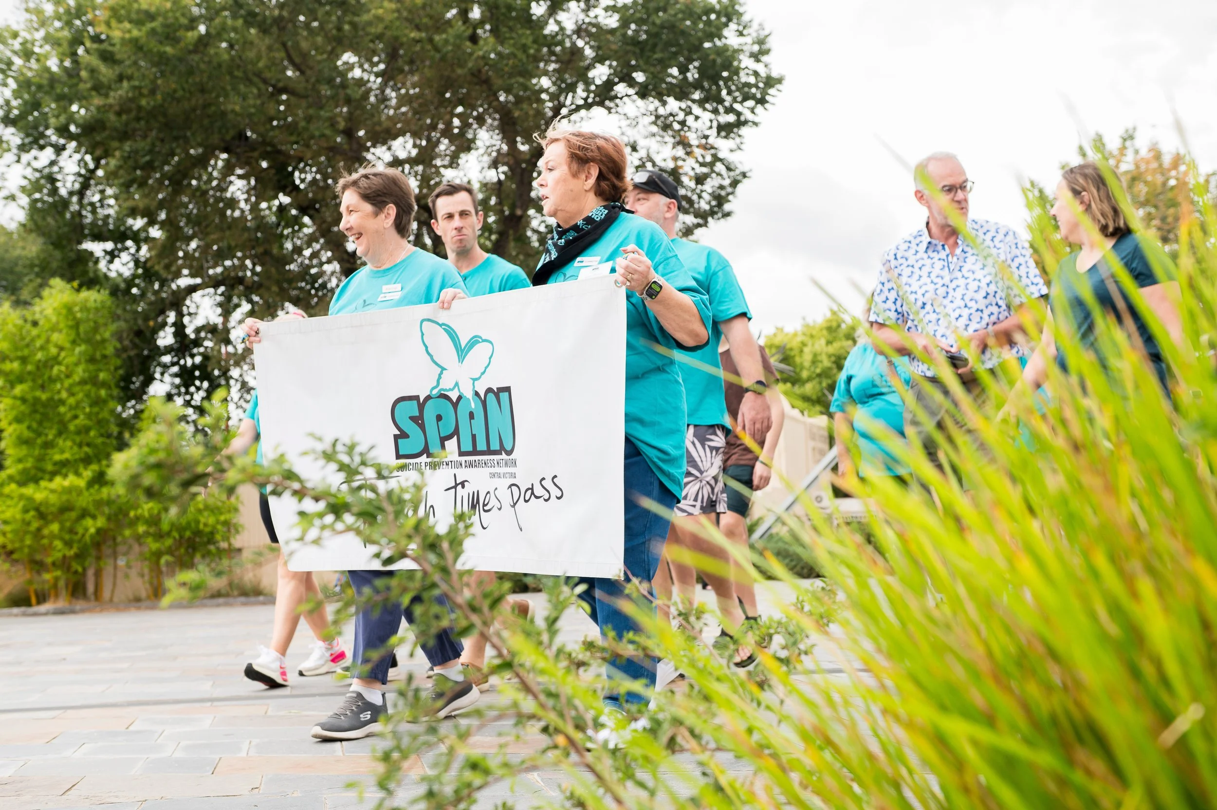
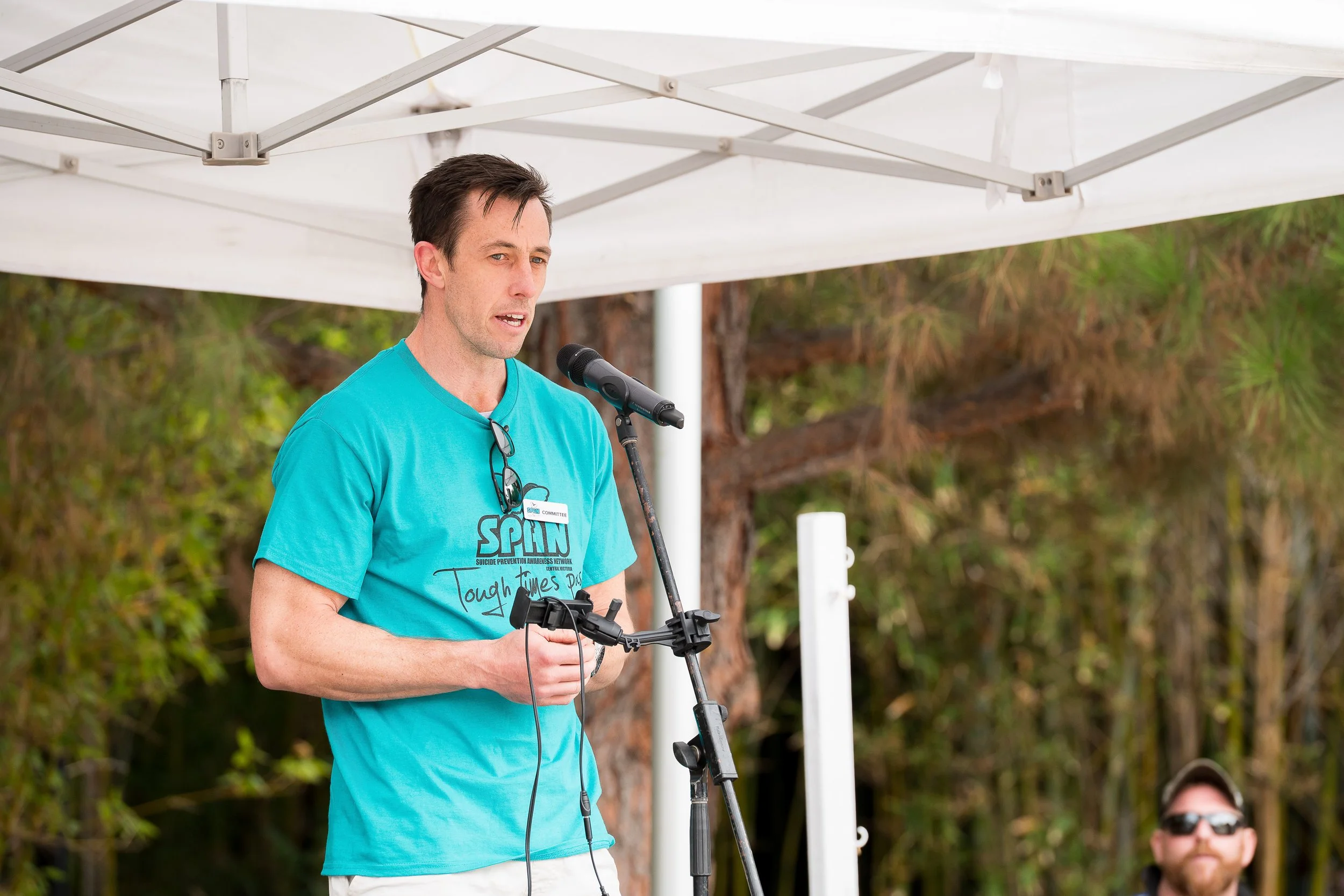
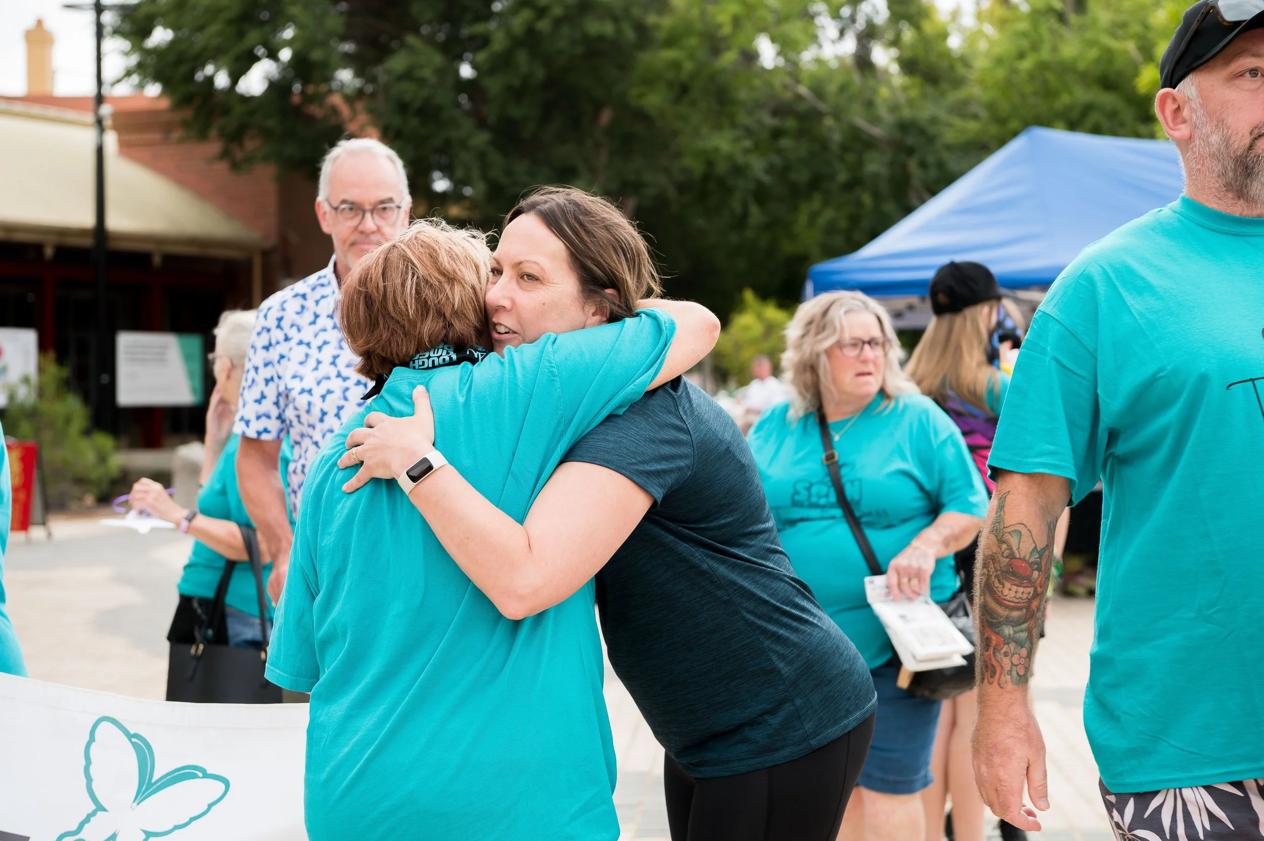
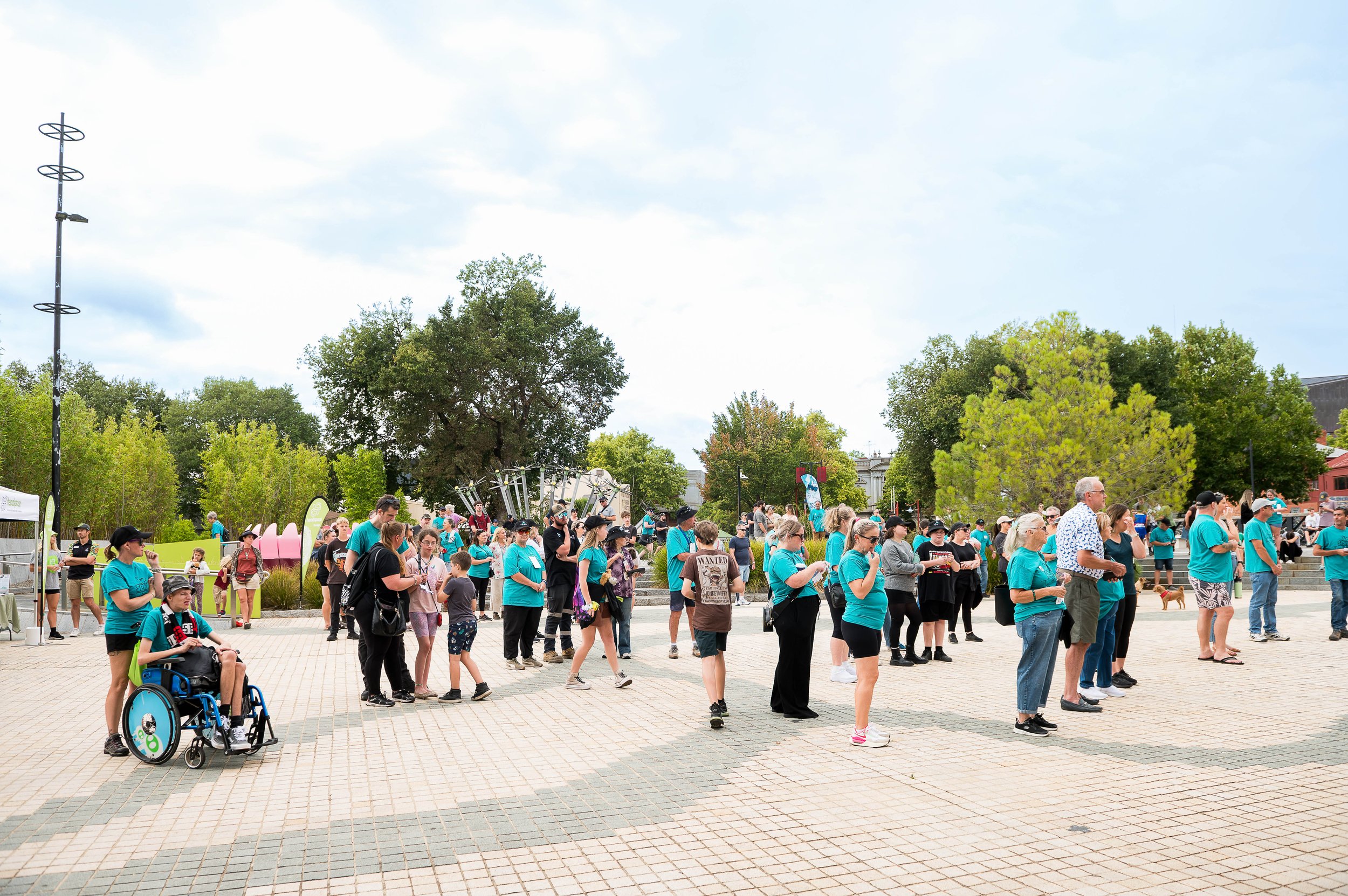
The Annual Walk: Community in Motion
The Annual Walk is central to SPAN’s identity.
We structured the site to give the event prominence — visually and strategically — ensuring it is:
Easy to find
Clearly explained
Emotionally resonant
Supported by strong imagery
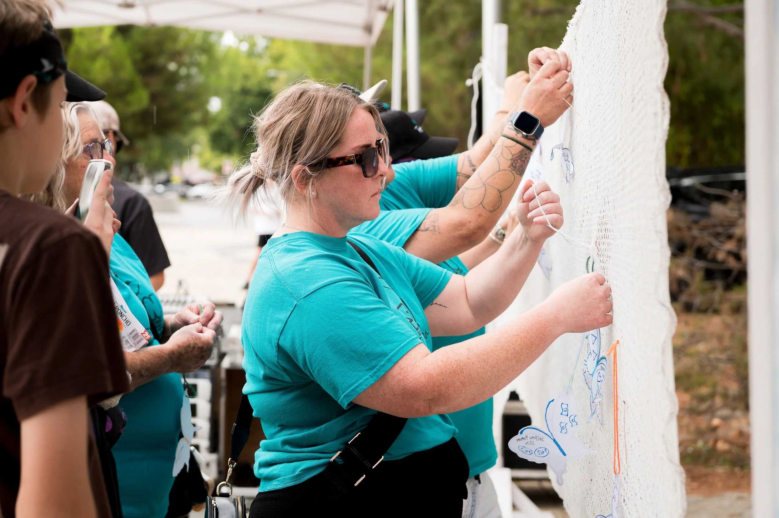
In 2025, our team proudly sponsored the photography for the Bendigo walk — capturing the strength, unity and quiet determination of the community walking side by side.
It was an honour to document such a powerful day, and we are looking forward to sponsoring again for the 2026 walk.
This partnership extends beyond digital support. It reflects our commitment to standing with our community.
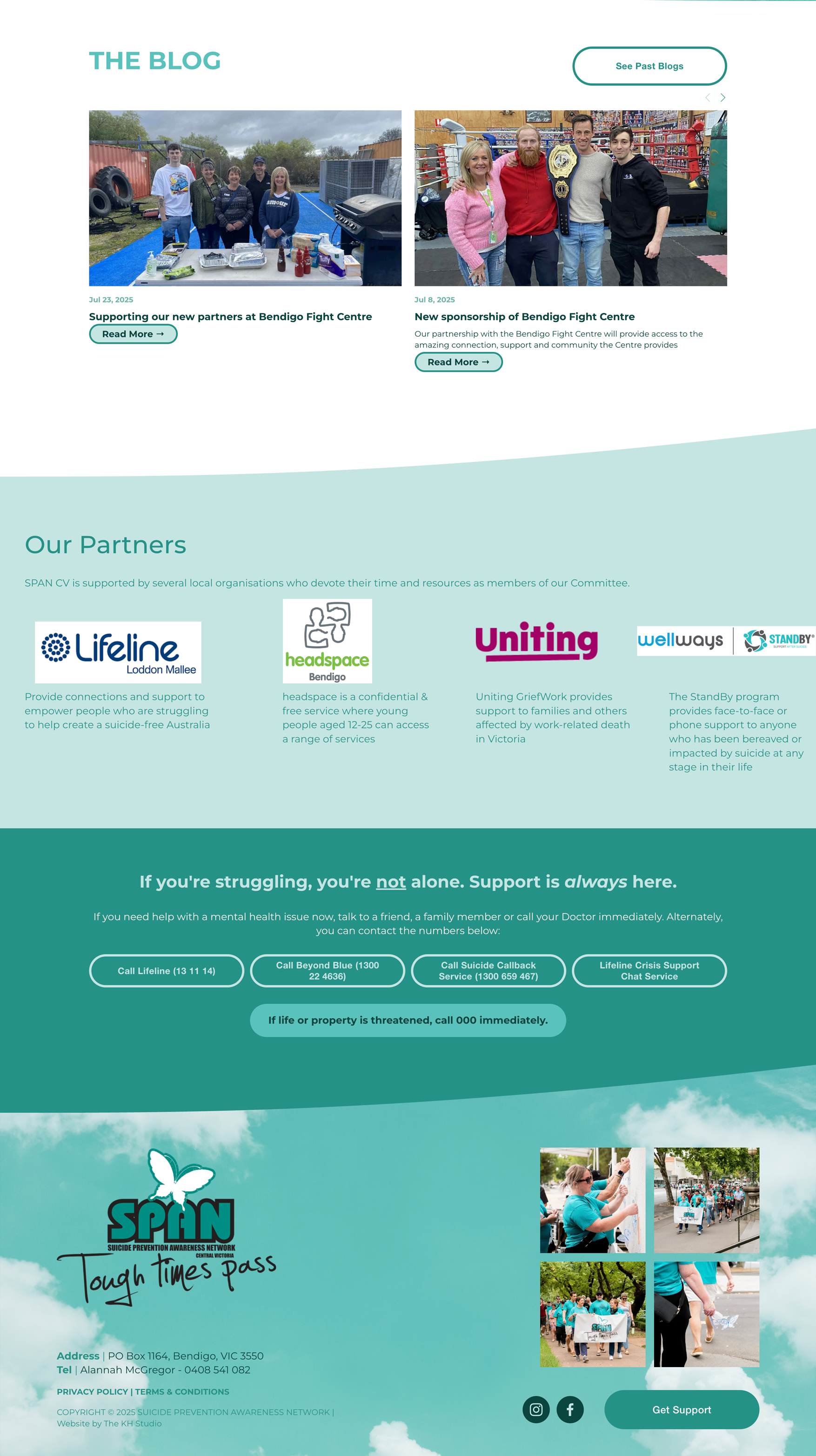
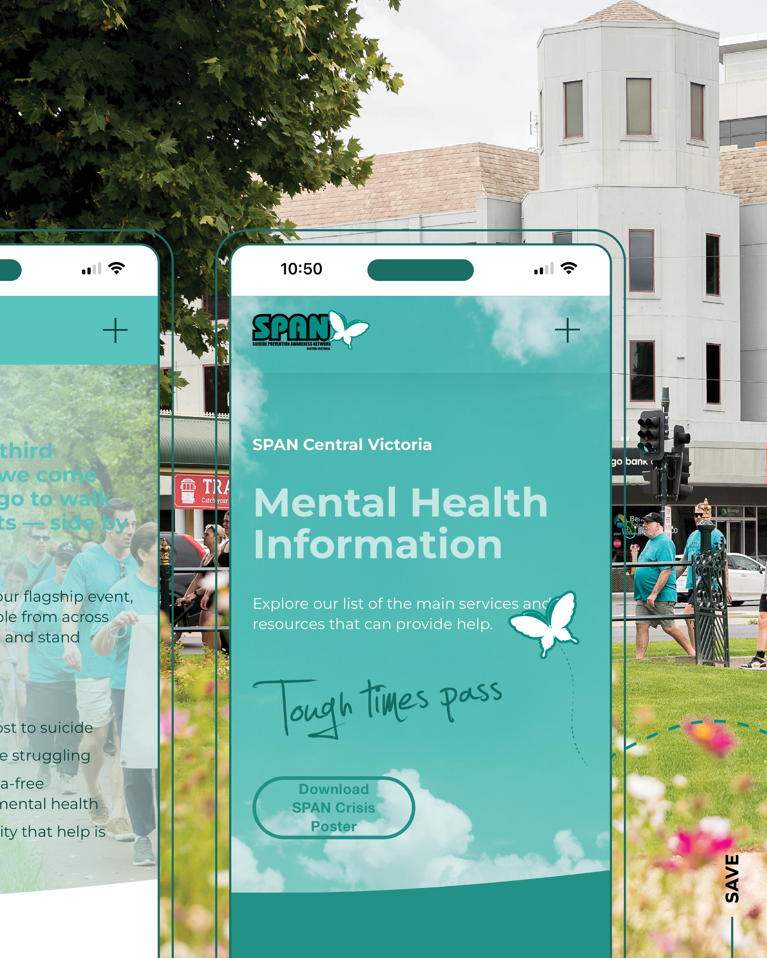
Resource Clarity & Partner Visibility
SPAN collaborates with key organisations including Lifeline, headspace, Uniting, Wellways and others.
We designed a clear partner section to:
Reinforce credibility
Show alignment with recognised services
Encourage further pathways to support
Resource visibility matters — especially when someone needs help immediately.
SEO With Responsibility
While SEO is critical for discoverability, this project required thoughtful implementation.
We optimised the site for:
Suicide prevention awareness searches
Bendigo-based mental health support
Annual walk and community event visibility
All content was written and structured carefully to avoid triggering language, while remaining accurate and searchable.
A Design Rooted in Hope
The visual direction reflects SPAN’s identity:
Calming teal and soft cloud gradients
Handwritten “Tough Times Pass” messaging
Butterfly symbolism
Community-centred photography
The design balances realism with reassurance.
It acknowledges that tough times exist — but reinforces that no one walks alone.
Why This Project Matters to Us
At The KH Studio, we believe design can be powerful.
But sometimes, it can also be protective.
This website creates:
A space for conversation
A pathway to support
A hub for community action
A digital extension of compassion
We are incredibly proud to support SPAN Central Victoria — not just as a client, but as a cause.
The Outcome
A strategic, sensitive, SEO-optimised website that:
Supports vulnerable visitors with clarity
Strengthens community awareness
Elevates the Annual Walk
Showcases partner credibility
Reflects SPAN’s heart and mission
Some projects grow businesses.
This one supports lives.
And that is something we are deeply honoured to be part of.
KH Website