#KHStudy for Stress Less Moves

Recent Website launch for Stress Less Moves
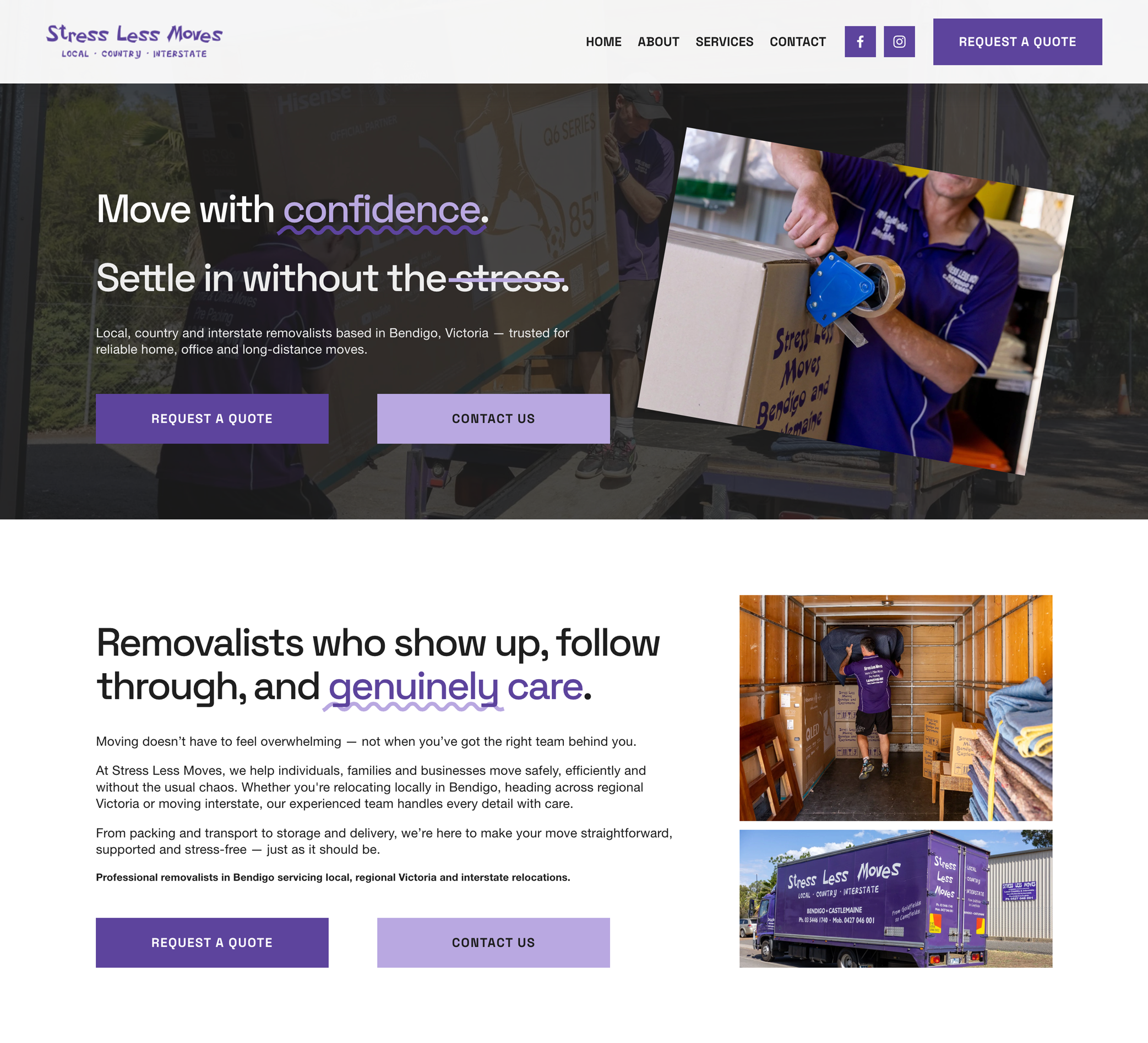
Removalist Website | UX, Brand Photography & Visual Refresh
Stress Less Moves is a moving and relocation business built around reliability, care and making what can often feel like a stressful process far more manageable.
Known for their approachable service and hands-on support, their team helps clients move with confidence, whether relocating homes, offices or large-scale items.
When they partnered with The KH Studio, the goal was to create a refreshed digital presence that better reflected the professionalism and personality of the business, while maintaining the strong brand recognition they had already established.
Rather than redesigning the logo, the focus was on uplevelling the visual experience — modernising the website and strengthening the brand through refined imagery and thoughtful design.
A Website Designed for Clarity and Confidence
For service-based businesses, trust is everything.
The website was designed to create a strong first impression while making it easy for users to understand the services offered and confidently take the next step.
Working closely with the Stress Less Moves team, we focused on:
Creating a cleaner, more modern visual direction
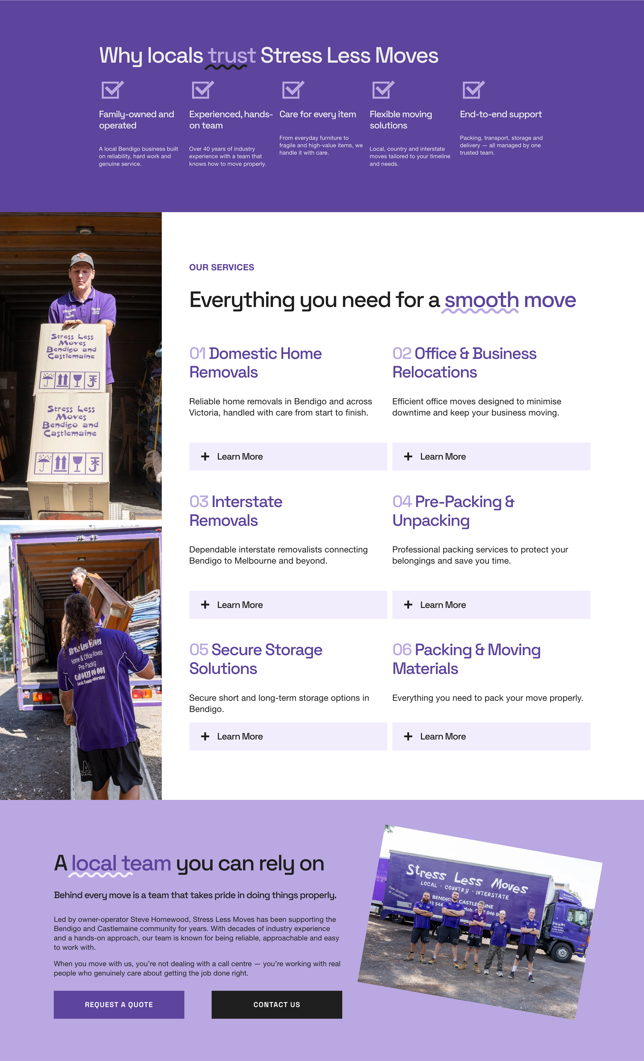
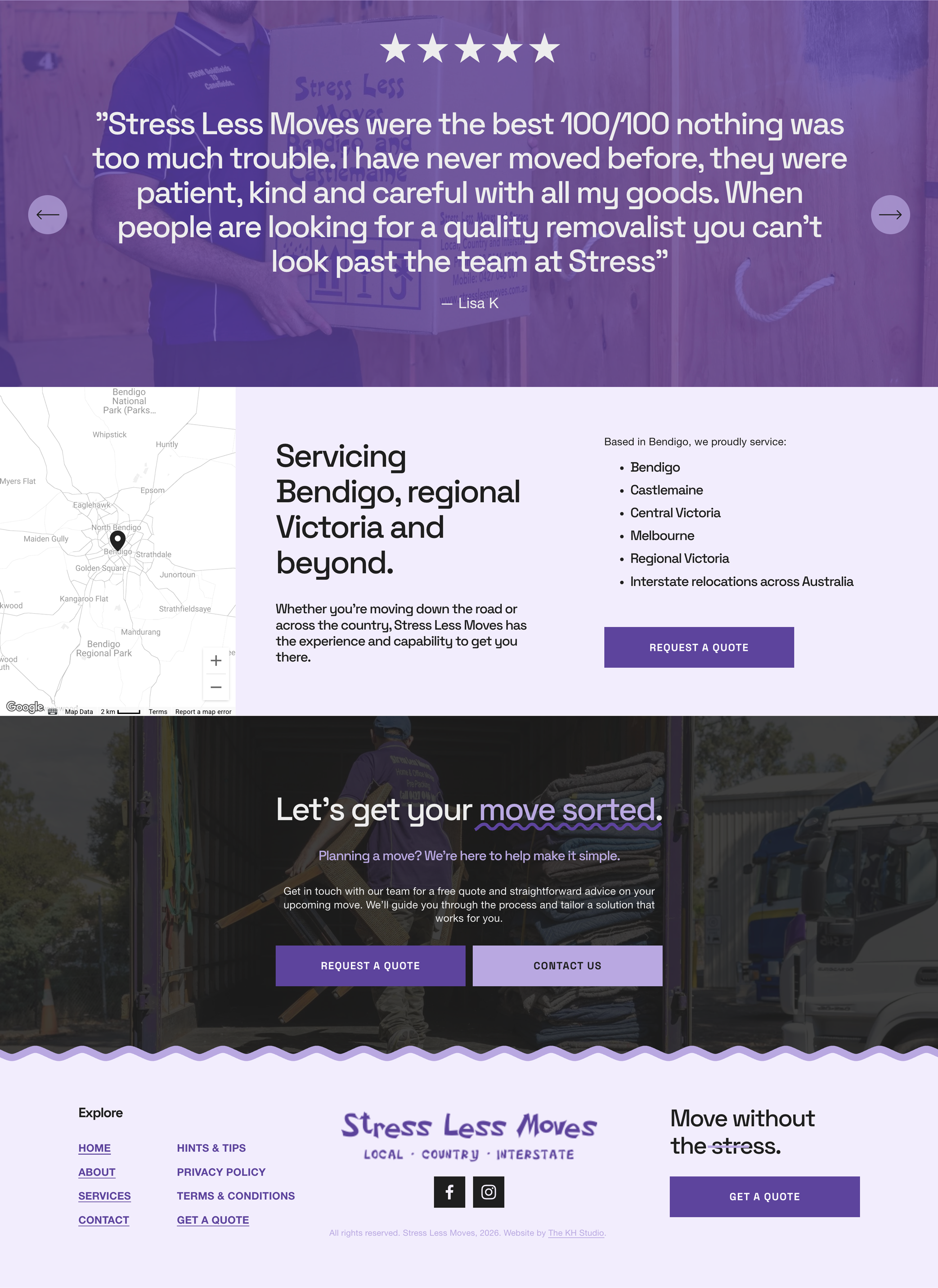
Simplifying the user experience and navigation
Clearly outlining services and enquiry pathways
Reinforcing professionalism through strong visual presentation
The result is a website that feels approachable, practical and easy to engage with.
Brand Photography That Feels Genuine
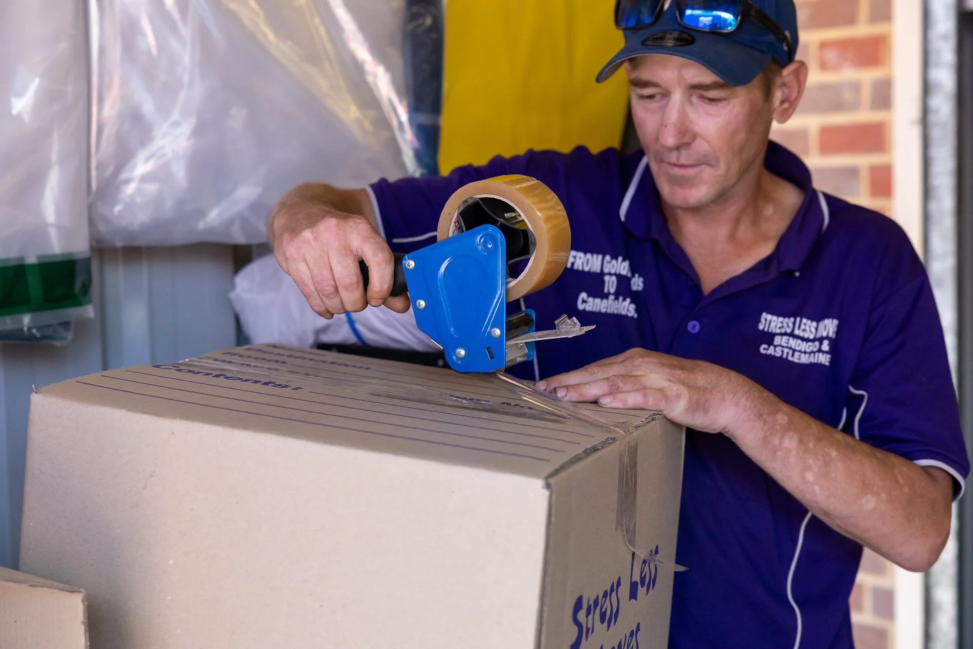
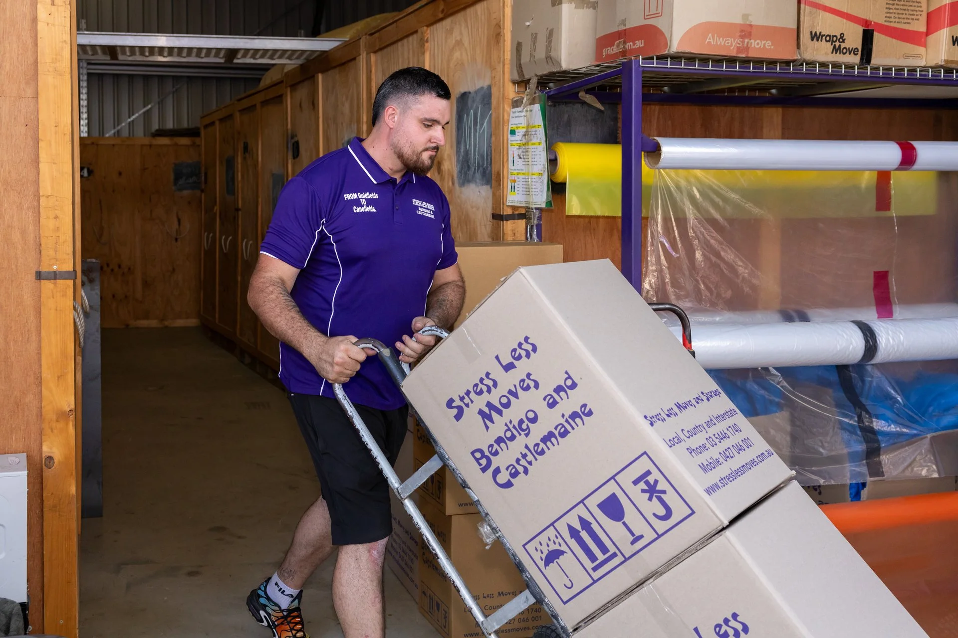
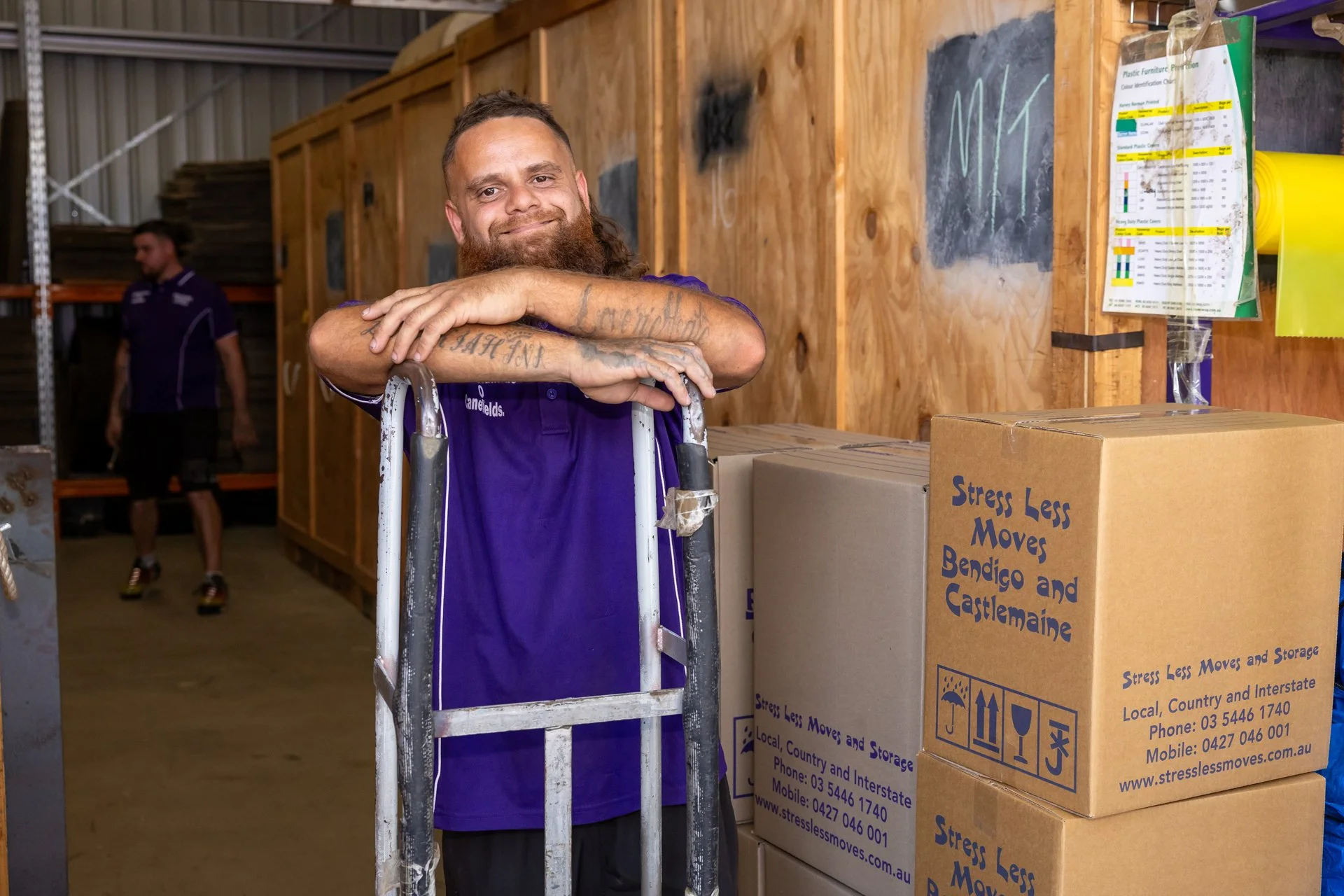
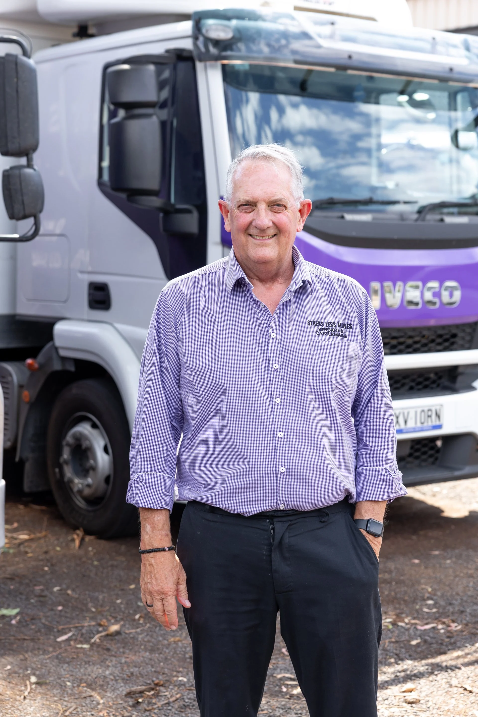
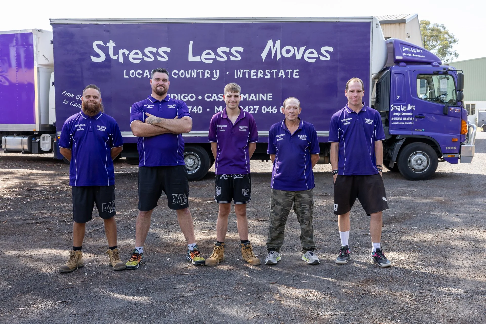
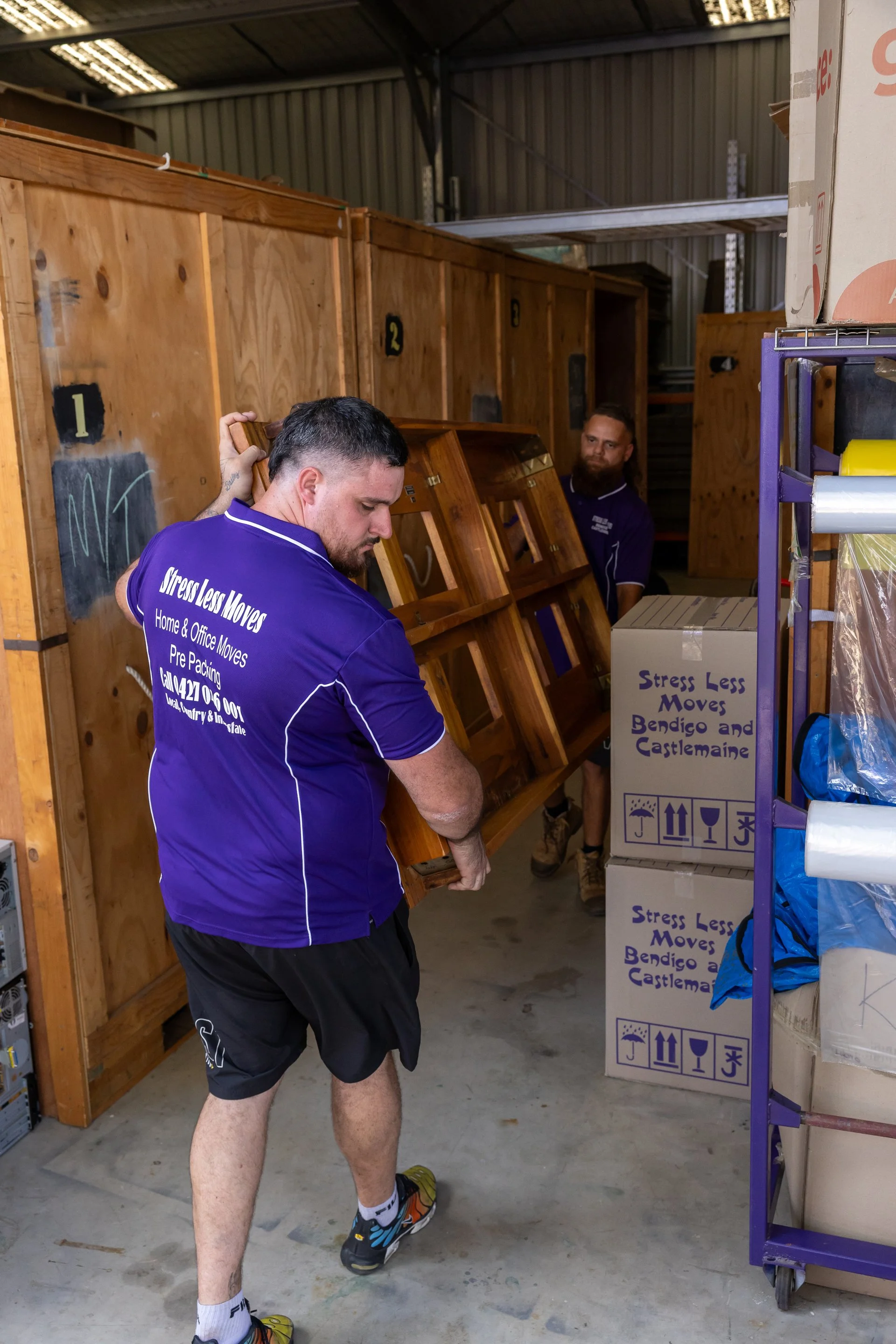
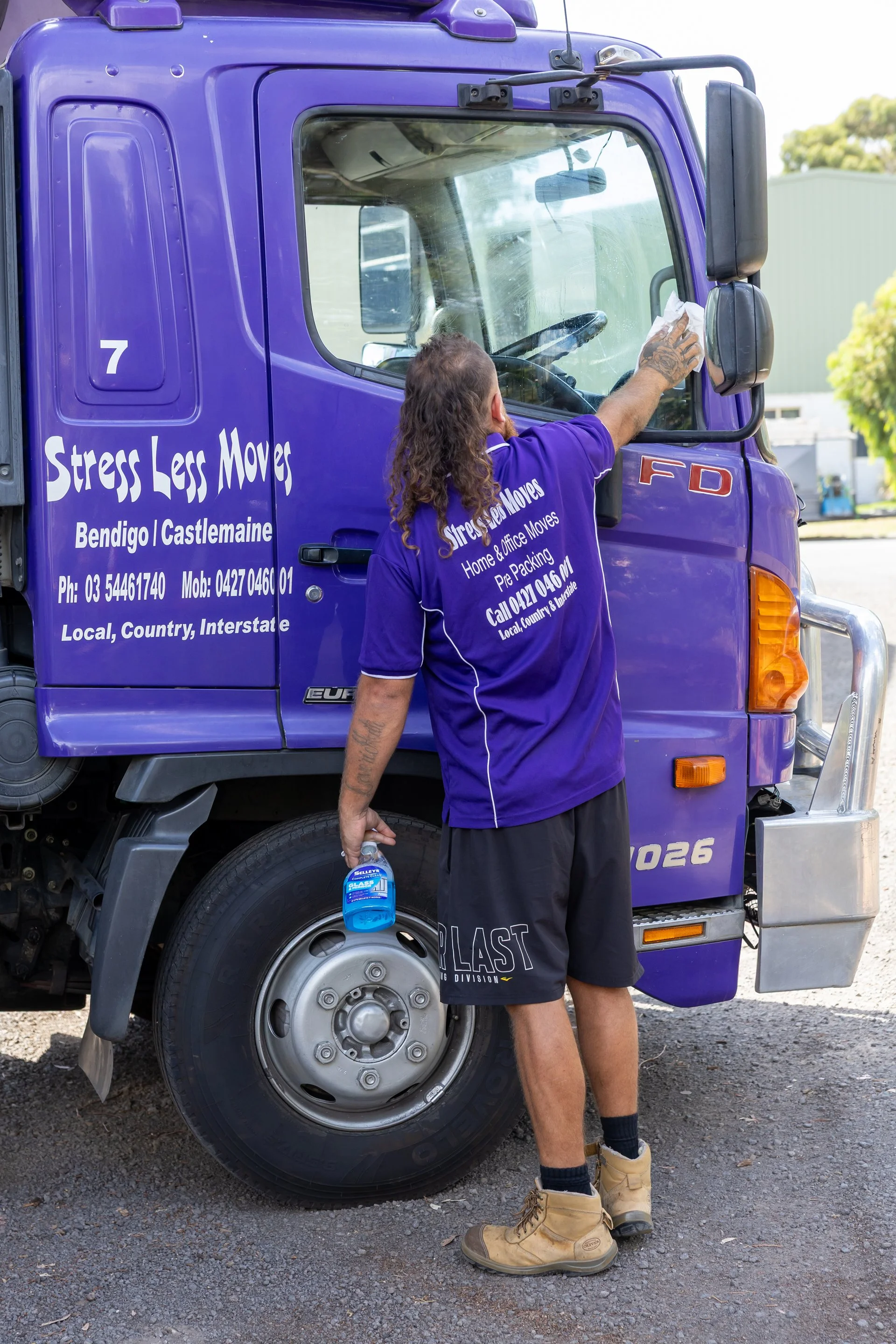
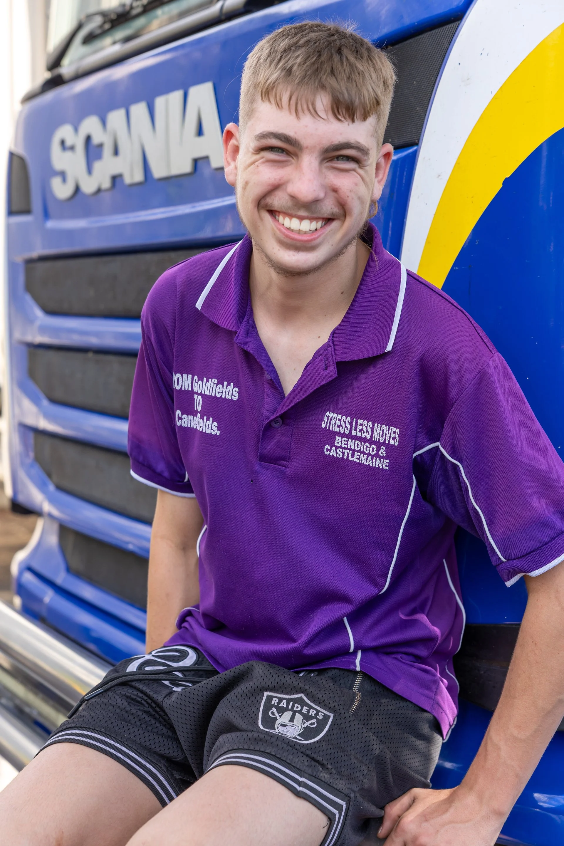
To support the refreshed website experience, we captured a suite of brand photography designed to showcase the people behind the business.
The photography direction focused on authenticity, highlighting the team, their process and the level of care they bring to every move.
By incorporating real imagery throughout the website, the digital experience feels more personal, trustworthy and relatable.
Refreshing the Brand Without Losing Recognition
Rather than completely reinventing the brand, this project focused on evolving and refining what already existed.
By retaining the existing logo and strengthening the surrounding visual identity, we were able to create a more polished and cohesive experience while maintaining familiarity for existing customers.
This approach allowed the business to feel elevated and modern without losing the recognition and trust they had already built within the community.
The Outcome
A refreshed digital presence that:
Modernises the visual identity of the business
Builds trust through authentic photography and clear communication
Improves the user experience and enquiry process
Creates a stronger and more professional first impression
This project demonstrates how thoughtful updates — even without a full rebrand — can significantly elevate the way a business is perceived online.
KH Website